
import os, sys
os.environ['TF_CPP_MIN_LOG_LEVEL'] = '2'
# 0 = all messages are logged (default behavior)
# 1 = INFO messages are not printed
# 2 = INFO and WARNING messages are not printed
# 3 = INFO, WARNING, and ERROR messages are not printed

# Ensure python module are found
sys.path.insert(0, '../src')
from models.train_model import train_xgboost

# Data visualization
from matplotlib import pyplot as plt
from matplotlib.collections import EllipseCollection
from matplotlib.colors import  Normalize
import seaborn as sns

# Data manipulation
import pandas as pd
import numpy as np

# Geospatial
from geopy import distance
import geopandas as gpd

# Machine learning
from sklearn.model_selection import train_test_split, GridSearchCV
from sklearn.tree import  DecisionTreeRegressor
from sklearn.cluster import MiniBatchKMeans
from sklearn.feature_selection import mutual_info_classif
from sklearn.metrics import mean_squared_error, make_scorer
import xgboost as xgb


import requests

# Random state
random_state = 42
np.random.seed(random_state)

# Palette color for plots
yellow ='#dfdc7bff'
grey = '#50566dff'
beige = '#d9cebfff'
orange = '#e5b97bff'
Outline
- 1. Data Preprocessing
- 2. Outlier
- 3. Feature Engineering
- 4. Split Data
- 5. Exploratory Data Analysis (EDA)
- 6. Model Training and Validation
- 7. Model Evaluation on Test Set
- 8. Conclusion
- 9. Deployment
In this project, we will build a machine learning model to predict the trip duration of taxi rides in New York City. The dataset is from Kaggle. The original dataset has approximately 1.4 million entries for the training set and 630k for the test set, although only the training set is utilized in this project. The dataset is then preprocessed, outliers are removed, and new features are created, followed by splitting it into train, test, and validation sets.
The goal is to predict the trip duration of taxi rides in New York City. The evaluation metric is the Root Mean Squared Logarithmic Error (RMSLE). The RMSLE is calculated by taking the log of the predictions and actual values. This metric ensures that errors in predicting short trip durations are less penalized compared to errors in predicting longer ones. For this purpose, we employ three types of machine learning models: mini-batch k-means to create new cluster features for the locations, and the Decision Tree Regressor and XGBoost to predict the trip duration.
Initially, the dataset has just 11 columns, offering great possibilities for developing new features and visualizations. The dataset has the following features:
-
id - a unique identifier for each trip.
-
vendor_id - a code indicating the provider associated with the trip record.
-
pickup_datetime - date and time when the meter was engaged.
-
dropoff_datetime - date and time when the meter was disengaged.
-
passenger_count - the number of passengers in the vehicle (driver entered value).
-
pickup_longitude - the longitude where the meter was engaged.
-
pickup_latitude - the latitude where the meter was engaged.
-
dropoff_longitude - the longitude where the meter was disengaged.
-
dropoff_latitude - the latitude where the meter was disengaged.
-
store_and_fwd_flag - This flag indicates whether the trip record was held in vehicle memory before sending to the vendor because the vehicle did not have a connection to the server Y=store and forward; N=not a store and forward trip.
-
trip_duration - duration of the trip in seconds.
1. Data Preprocessing
taxi_trip = pd.read_csv('../data/raw/nyc-yellow-taxi-trip-2016.csv',
                parse_dates=['pickup_datetime','dropoff_datetime'])

display(taxi_trip.head(3))

print("Shape:", taxi_trip.shape)
| id | vendor_id | pickup_datetime | dropoff_datetime | passenger_count | pickup_longitude | |
|---|---|---|---|---|---|---|
| 0 | id2875421 | 2 | 2016-03-14 17:24:55 | 2016-03-14 17:32:30 | 1 | -73.982155 |
| 1 | id2377394 | 1 | 2016-06-12 00:43:35 | 2016-06-12 00:54:38 | 1 | -73.980415 |
| 2 | id3858529 | 2 | 2016-01-19 11:35:24 | 2016-01-19 12:10:48 | 1 | -73.979027 |
| pickup_latitude | dropoff_longitude | dropoff_latitude | store_and_fwd_flag | trip_duration | |
|---|---|---|---|---|---|
| 0 | 40.767937 | -73.964630 | 40.765602 | N | 455 |
| 1 | 40.738564 | -73.999481 | 40.731152 | N | 663 |
| 2 | 40.763939 | -74.005333 | 40.710087 | N | 2124 |
Shape: (1458644, 11)
Let’s check the dataset information, and see if there is any missing value or duplicated rows:
print(taxi_trip.info())
print("\n Duplicated rows:", taxi_trip.duplicated().sum())
print("\n Missing values:", taxi_trip.isnull().sum().sum())
<class 'pandas.core.frame.DataFrame'>
RangeIndex: 1458644 entries, 0 to 1458643
Data columns (total 11 columns):
 #   Column              Non-Null Count    Dtype
---  ------              --------------    -----
 0   id                  1458644 non-null  object
 1   vendor_id           1458644 non-null  int64
 2   pickup_datetime     1458644 non-null  datetime64[ns]
 3   dropoff_datetime    1458644 non-null  datetime64[ns]
 4   passenger_count     1458644 non-null  int64
 5   pickup_longitude    1458644 non-null  float64
 6   pickup_latitude     1458644 non-null  float64
 7   dropoff_longitude   1458644 non-null  float64
 8   dropoff_latitude    1458644 non-null  float64
 9   store_and_fwd_flag  1458644 non-null  object
 10  trip_duration       1458644 non-null  int64
dtypes: datetime64[ns](2), float64(4), int64(3), object(2)
memory usage: 122.4+ MB
None

 Duplicated rows: 0

 Missing values: 0
There are no missing values or duplicated rows. The only feature that we need to change is store_and_fwd_flag, which is a categorical feature ${N, Y}$. We will change it to a boolean mapping Y to True and N to False:
# Map store_and_fwd_flag to True and False
taxi_trip['store_and_fwd_flag'] = taxi_trip['store_and_fwd_flag'].map({'N': False, 'Y': True})
Let’s verify if the target feature trip_duration is correct by calculating the time difference between dropoff_datetime and pickup_datetime in seconds :
trip_duration = (taxi_trip['dropoff_datetime'] - taxi_trip['pickup_datetime']).dt.seconds

is_diff = (trip_duration != taxi_trip['trip_duration'])
print( 'Number of incorrect values in trip_duration:',is_diff.sum())

display(taxi_trip[is_diff])
Number of incorrect values in trip_duration: 4
| id | vendor_id | pickup_datetime | dropoff_datetime | passenger_count | pickup_longitude | |
|---|---|---|---|---|---|---|
| 355003 | id1864733 | 1 | 2016-01-05 00:19:42 | 2016-01-27 11:08:38 | 1 | -73.789650 |
| 680594 | id0369307 | 1 | 2016-02-13 22:38:00 | 2016-03-08 15:57:38 | 2 | -73.921677 |
| 924150 | id1325766 | 1 | 2016-01-05 06:14:15 | 2016-01-31 01:01:07 | 1 | -73.983788 |
| 978383 | id0053347 | 1 | 2016-02-13 22:46:52 | 2016-03-25 18:18:14 | 1 | -73.783905 |
| pickup_latitude | dropoff_longitude | dropoff_latitude | store_and_fwd_flag | trip_duration | |
|---|---|---|---|---|---|
| 355003 | 40.643559 | -73.956810 | 40.773087 | False | 1939736 |
| 680594 | 40.735252 | -73.984749 | 40.759979 | False | 2049578 |
| 924150 | 40.742325 | -73.985489 | 40.727676 | False | 2227612 |
| 978383 | 40.648632 | -73.978271 | 40.750202 | False | 3526282 |
It appears that there are four extreme values in the target feature trip_duration that don’t make sense. We can correct then by substituting the values of the actual trip duration in seconds that was calculated. Let’s simple substitute for the correct column that we calculate:
taxi_trip['trip_duration'] = trip_duration

# Let's check again
is_diff = (trip_duration != taxi_trip['trip_duration'])
print( 'Number of incorrect values in trip_duration:',is_diff.sum())
Number of incorrect values in trip_duration: 0
2. Outliers
To identify outliers in the dataset, we will employ geospatial visualization for the pickup and dropoff locations and the interquartile range (IQR) with a box plot to detect outliers in the trip_duration. First, let’s examine all features with data types float64 and int64 in the dataset:
taxi_trip_filtered = taxi_trip.select_dtypes(include=['float64', 'int64'])
display(taxi_trip_filtered.info())
<class 'pandas.core.frame.DataFrame'>
RangeIndex: 1458644 entries, 0 to 1458643
Data columns (total 6 columns):
 #   Column             Non-Null Count    Dtype
---  ------             --------------    -----
 0   vendor_id          1458644 non-null  int64
 1   passenger_count    1458644 non-null  int64
 2   pickup_longitude   1458644 non-null  float64
 3   pickup_latitude    1458644 non-null  float64
 4   dropoff_longitude  1458644 non-null  float64
 5   dropoff_latitude   1458644 non-null  float64
dtypes: float64(4), int64(2)
memory usage: 66.8 MB


None
2.1. Location Features
When looking for outlier in the dataset, we should focus on numerical features. To find out if there is any outliers, we can analyze the features pickup_longitude, pickup_latitude, dropoff_longitude, dropoff_latitude
trip_outliers = taxi_trip.copy()

# can be useful to separate the features
pickup_dropoff_features = [ 'pickup_longitude', 'pickup_latitude',
                            'dropoff_longitude', 'dropoff_latitude' ]

pickup_long = trip_outliers['pickup_longitude']
pickup_lat = trip_outliers['pickup_latitude']
dropoff_long = trip_outliers['dropoff_longitude']
dropoff_lat = trip_outliers['dropoff_latitude']

# Summary statistics
display(    trip_outliers.groupby('passenger_count')[pickup_dropoff_features[:2]]
            .agg(['min', 'mean', 'max']))

display(    trip_outliers.groupby('passenger_count')[pickup_dropoff_features[2:]]
            .agg(['min', 'mean', 'max']))
| pickup_longitude | pickup_latitude | |||||
|---|---|---|---|---|---|---|
| min | mean | max | min | mean | max | |
| passenger_count | ||||||
| 0 | -74.042969 | -73.957256 | -73.776367 | 40.598701 | 40.736596 | 40.871922 |
| 1 | -79.569733 | -73.973551 | -65.897385 | 36.118538 | 40.751209 | 51.881084 |
| 2 | -121.933342 | -73.973343 | -61.335529 | 34.359695 | 40.749811 | 41.319164 |
| 3 | -75.455917 | -73.974312 | -73.722374 | 39.803932 | 40.750224 | 41.189957 |
| 4 | -75.354332 | -73.973836 | -73.559799 | 34.712234 | 40.749328 | 40.945747 |
| 5 | -74.191154 | -73.972432 | -71.799896 | 35.081532 | 40.750801 | 40.925323 |
| 6 | -74.145752 | -73.973227 | -73.653358 | 40.213837 | 40.751611 | 40.896381 |
| 7 | -74.173668 | -73.948100 | -73.631149 | 40.715031 | 40.740285 | 40.768551 |
| 8 | -73.992653 | -73.992653 | -73.992653 | 40.768719 | 40.768719 | 40.768719 |
| 9 | -73.710632 | -73.710632 | -73.710632 | 40.671581 | 40.671581 | 40.671581 |
| dropoff_longitude | dropoff_latitude | |||||
|---|---|---|---|---|---|---|
| min | mean | max | min | mean | max | |
| passenger_count | ||||||
| 0 | -74.188072 | -73.963539 | -73.776360 | 40.598701 | 40.735779 | 40.872318 |
| 1 | -80.355431 | -73.973371 | -65.897385 | 36.118538 | 40.751977 | 43.911762 |
| 2 | -121.933304 | -73.973464 | -61.335529 | 34.359695 | 40.751070 | 43.921028 |
| 3 | -74.550011 | -73.974016 | -73.055977 | 40.435646 | 40.751601 | 41.387001 |
| 4 | -74.569748 | -73.974422 | -73.170937 | 32.181141 | 40.750786 | 41.029831 |
| 5 | -79.352837 | -73.973206 | -72.954590 | 40.436329 | 40.751590 | 41.281796 |
| 6 | -74.220955 | -73.973192 | -73.524658 | 40.553467 | 40.752375 | 40.982738 |
| 7 | -74.173660 | -73.948097 | -73.631149 | 40.715019 | 40.740289 | 40.768551 |
| 8 | -74.041374 | -74.041374 | -74.041374 | 40.729954 | 40.729954 | 40.729954 |
| 9 | -73.710632 | -73.710632 | -73.710632 | 40.671581 | 40.671581 | 40.671581 |
We can observe that there are unrealistic values for passenger_count. The expected values for passenger_count are between 1 and 6, but there are atypical counts of 0 and values greater than 6. Let’s remove those outliers:
# Boolean series for passenger count outliers
passenger_outliers = (trip_outliers['passenger_count'] == 0) | (trip_outliers['passenger_count'] > 6)

not_outliers = ~passenger_outliers
trip_outliers = trip_outliers[not_outliers]


print(f'\nOutliers in passenger_count: {passenger_outliers.sum()}')
Outliers in passenger_count: 65
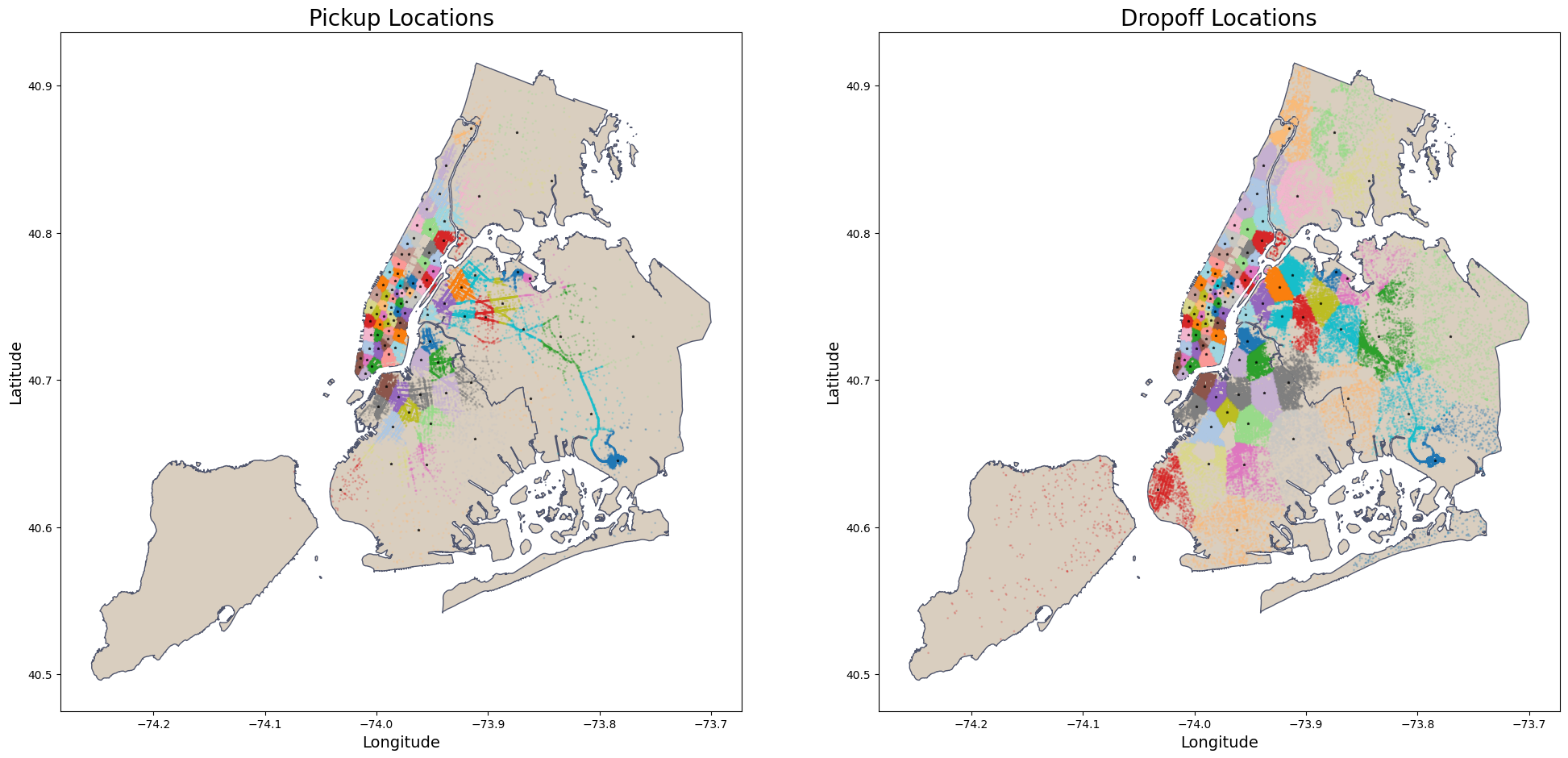
The boxplot for detecting outliers relies on the assumption that the data has a distribution close to normal (Gaussian), which is often not true with geospatial coordinates due to their unique patterns influenced by urban roads and traffic. Therefore, we will use a different approach to identify outliers in the location features.
For pickup and dropoff locations, the strategy is to use geospatial data using shapfile from NYC Borough Boundaries to identify points that fall outside the boundaries of NYC map as outliers.
def plot_points_map(df, gdf_map, geometry_col, ax, title='', within_map=True,
                    color_map='beige', color_points='orange'):
    """
    Plots a map with points from a DataFrame onto a given Axes object.

    Parameters:
    - df: DataFrame with the coordinates to plot.
    - gdf_map: GeoDataFrame of the map boundaries.
    - geometry_col: GeoDataFrame column with geometry data.
    - ax: Matplotlib Axes object to plot on.
    - title: Title of the plot.
    - within_map: If True, only plots points within the map boundaries.
    - color_map: Color for the map.
    - color_points: Color for the points.
    """
    # convert to the same coordinate reference system
    gdf_points = gpd.GeoDataFrame(df, geometry=geometry_col)
    # convert to the same coordinate reference system
    gdf_points.crs = gdf_map.crs

    # If within_map is True, perform spatial join with the map boundaries
    # only points within the boundaries will be plotted
    if within_map:
        gdf_points = gpd.sjoin(gdf_points, gdf_map, how="inner", predicate='within')
        # Update the original DataFrame
        df = df.loc[gdf_points.index]

    # Plot the map and the points
    gdf_map.plot(ax = ax, color=color_map, edgecolor='grey')
    gdf_points.plot(ax =ax, markersize=1, color = color_points)
    ax.set_xlabel('Longitude', fontsize=14)
    ax.set_ylabel('Latitude', fontsize=14)
    ax.set_title(title, fontsize=20)

    return df
nybb_path = '../data/external/nyc-borough-boundaries/geo_export_e13eede4-6de2-4ed8-98a0-58290fd6b0fa.shp'
nyc_boundary = gpd.read_file(nybb_path)
# Creating the geometry for points
geometry = gpd.points_from_xy(trip_outliers['pickup_longitude'], trip_outliers['pickup_latitude'])
# Creating the plot
fig, ax = plt.subplots(figsize=(12, 12))
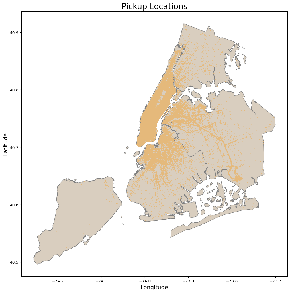
pickup_within_nyc = plot_points_map( df = trip_outliers, gdf_map = nyc_boundary,
geometry_col = geometry, ax = ax, title = 'Pickup Locations',
color_map= beige, color_points= orange )
# Showing the plot
plt.show()
print(f'Number of outliers removed: {len(trip_outliers) - len(pickup_within_nyc)}')
Number of outliers removed: 1216
geometry = gpd.points_from_xy(pickup_within_nyc['dropoff_longitude'],
                                pickup_within_nyc['dropoff_latitude'])

fig, ax = plt.subplots(figsize=(12, 12))
pickup_dropoff_within_nyc = plot_points_map(    df = pickup_within_nyc, gdf_map = nyc_boundary,
                                                geometry_col = geometry, ax = ax, title =  'Dropoff Locations',
                                                color_map= beige, color_points= orange  )
plt.show()

print(f'Number of outliers removed:{len(pickup_within_nyc) - len(pickup_dropoff_within_nyc)}' )
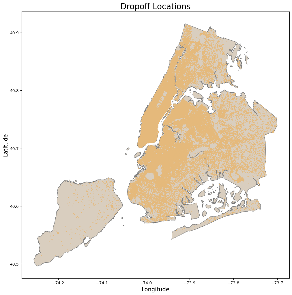
Number of outliers removed:5359
2.2. Target Feature (Trip Duration)
# Copy the dataset with removed outliers from locations
trip_outliers = pickup_dropoff_within_nyc.copy()
The interquartile range (IQR)
The IQR gives a sense of how spread out the values in a dataset are and is a robust measure of dispersion that is not influenced by outliers.
A quartile divides data into four equal parts, each comprising 25% of the data. $Q_1$ represents the 25th percentile of the data, meaning 25% of data points are less than or equal to this value. $Q_3$ represents the 75th percentile, implying that 75% of data points are less than or equal to this value.
Let’s calculate the IQR for the target feature trip_duration and plot a blox plot to visualize the outliers:
def boxplot_stats(series, whis = 1.5):
    """
    Calculate the statistics for a box plot.

    Returns:
    dict: A dictionary containing the quartiles, IQR, and whisker limits.
    """
    Q1 = series.quantile(0.25)
    Q2 = series.quantile(0.50)
    Q3 = series.quantile(0.75)
    IQR = Q3 - Q1

    lower_whisker = Q1 - whis * IQR
    upper_whisker = Q3 + whis * IQR

    return {
        'Q1': Q1,
        'Q2': Q2,
        'Q3': Q3,
        'IQR': IQR,
        'lower_whis': lower_whisker,
        'upper_whis': upper_whisker
    }
def plot_distribution_boxplot(  series, ax1, ax2, title='', label='', log1p=True,
                                draw_quartiles=True, kde=True):
    """
    Plot the distribution and boxplot of a series on given axes.

    Args:
    - series (pandas.Series): The series to plot.
    - ax1 (matplotlib.axes.Axes): The axes for the histogram.
    - ax2 (matplotlib.axes.Axes): The axes for the boxplot.
    - title (str): The title of the plot.
    - label (str): The label for the x-axis.
    - log1p (bool): If True, applies log1p transformation to the series.
    - draw_quartiles (bool): If True, draws quartile lines on the histogram.
    - kde (bool): If True, plots a KDE over the histogram.
    """
    if log1p:
        series = np.log1p(series)
    stats = boxplot_stats(series)

    sns.histplot(   series, bins=40, linewidth=0.5, color='#dfdc7bff', alpha=0.2,
                    ax=ax1, kde=kde, line_kws={'lw': 3})
    ax1.set_title(f'{title} Histogram', fontsize=15)
    ax1.set_xlabel(label, fontsize=14)
    ax1.set_ylabel('Count', fontsize=14)

    sns.boxplot(data=series, color='#dfdc7bff', ax=ax2,
                fliersize=3, flierprops={'color': '#50566dff', 'markeredgecolor': '#50566dff'})

    ax2.set_title(f'{title} Boxplot', fontsize=15)
    ax2.set_ylabel(label, fontsize=14)

    if draw_quartiles:
        quartiles = [stats['Q1'], stats['Q3'], stats['lower_whis'], stats['upper_whis']]
        for line in quartiles:
            ax1.axvline(line, color='#50566dff', linestyle='--', alpha=1, lw=2)
            y_center = ax1.get_ylim()[1] / 2
            ax1.text(   line, y_center, f'{line:.2f}',
                        fontsize=18, color='black', va='center', ha='right', rotation=90)
fig, (ax1, ax2) = plt.subplots(1, 2, figsize=(15, 8))
plot_distribution_boxplot(  trip_outliers['trip_duration'], ax1, ax2,
                            title='Trip Duration', label='Log of Trip Duration (s)')

plt.tight_layout()
plt.show()
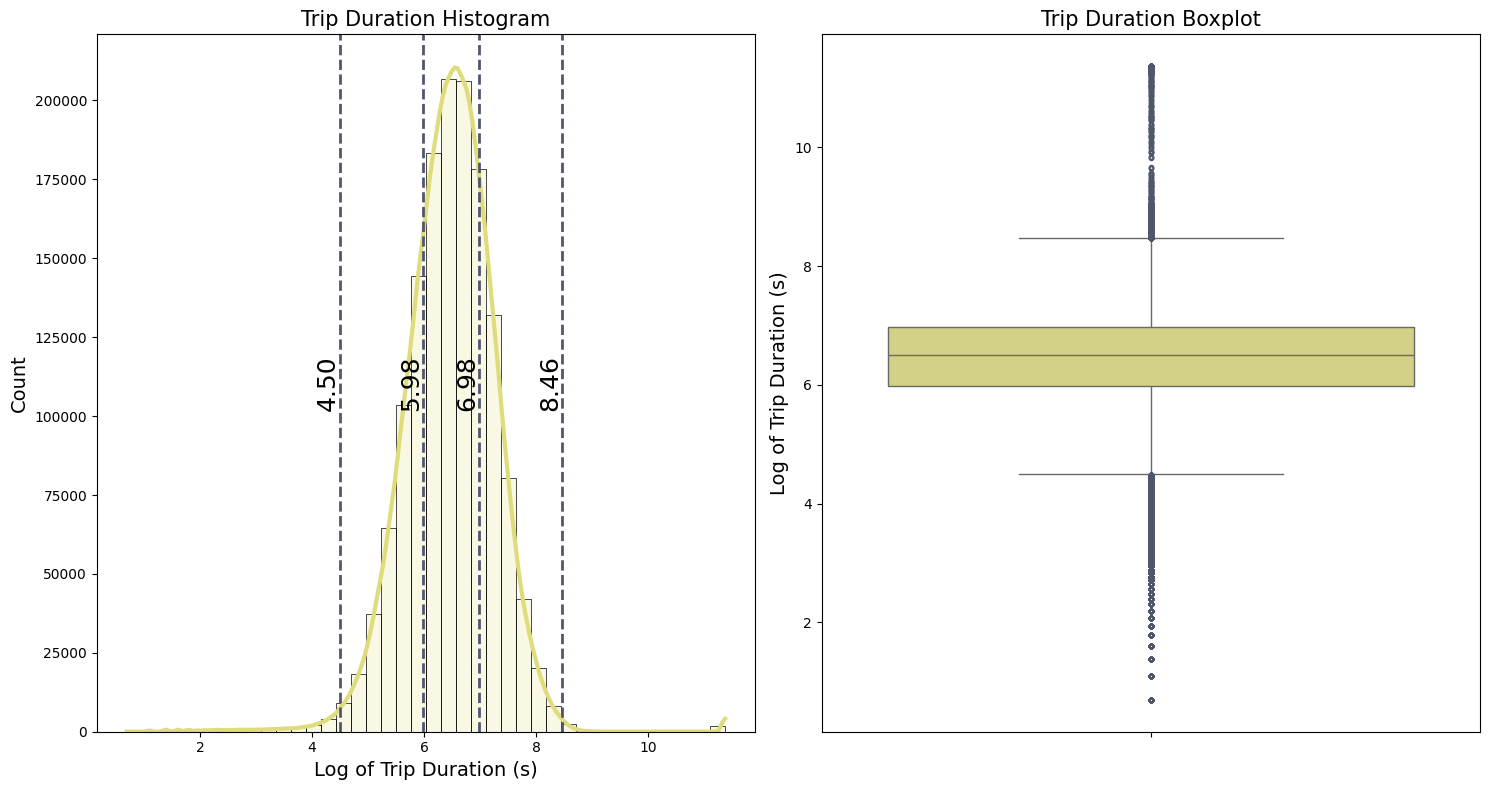
Because of the high values and zeros in the target feature trip_duration, we apply the logarithmic transformation $\log(x+1)$. This transformation reduces the effect of outliers and the overall variance in the dataset.The histogram, illustrated in the first plot, resembles a bell curve after applying this transformation. From the boxplot, we can see:
-
The first and third quartiles ($Q_1$ and $Q_3$) representing the 25th and 75th percentiles, are:
- $Q_1 = 5.98$
- $Q_3 = 6.98$
- The interquartile range (IQR) is the difference between the third and first quartiles:
- IQR = $Q_3 - Q_1 = 0.99$
- The whiskers indicate the range of the data:
- The lower whisker : $Q_1 - 1.5 IQR = 4.50$
- The upper whisker : $Q_3 + 1.5 IQR = 8.46$
Data points outside the whiskers are potential outliers that need further validation. For better intuition, we convert these whisker values from the log scale back to the original scale in terms of hours ($\text{Hours} = \text{Seconds}/3600$ ):
\(\frac{\exp(4.50) - 1}{3600} \approx 0.024 ~~\text{hours}\) \(\frac{\exp(8.46) - 1}{3600} \approx 1.32 ~~\text{hours}\)
The lower whisker corresponds to approximately 1.4 minutes, which is very short for a taxi trip duration, suggesting that these could be errors or special cases.The upper whisker suggests a more plausible trip duration of about 1.32 hours, but with very unrealistic high values with more than 20 hours of duration.
def count_outliers(series, whis = 1.5):
        """
        Count the number of upper and lower outliers in the series and print their percentages.

        Args:
        series (pd.Series): Series for which to count outliers.

        Returns:
        (pd.Series, pd.Series): Two boolean series, one for upper outliers and one for lower outliers.
        """

        stats = boxplot_stats(series, whis)


        upper_outliers = (series > stats['upper_whis'])
        lower_outliers = (series < stats['lower_whis'])

        # Percentage of outliers
        percentage_upper = upper_outliers.sum() / len(series) * 100
        percentage_lower = lower_outliers.sum() / len(series) * 100

        print(  f'\nPotential upper outliers: {upper_outliers.sum()} '
                f'({percentage_upper:.2f}% of the dataset)')

        print(  f'\nPotential lower outliers: {lower_outliers.sum()} '
                f'({percentage_lower:.2f}% of the dataset)')

        return upper_outliers, lower_outliers
log_trip_duration = np.log1p(trip_outliers['trip_duration'])
upper_duration_outliers, lower_duration_outliers = count_outliers(log_trip_duration)
Potential upper outliers: 4292 (0.30% of the dataset)

Potential lower outliers: 14461 (1.00% of the dataset)
Let’s compare the trip durations with some distance measures from the pickup location to the dropoff location. In an article on New York City taxi trip duration prediction using MLP and XGBoost, some distance measures were discussed, like Manhattan, haversine, and bearing distances. Unlike the straight-line Euclidean distance, the Manhattan distance calculates the sum of the absolute differences between the horizontal and vertical coordinates, which resembles navigating an actual grid of city streets. However, this doesn’t account for the Earth’s curvature. To address this, the article also considers the haversine distance, which is more appropriate for large distances as it does account for the Earth’s curvature. Bearing distance calculates the direction between two points.
I will just adopt a simplified approach that still accounts for the Earth’s curvature. The Geodesic distance is the small path between two points on the surface of a curved object, for our case the Earth surface. To achieve This we use the geopy library:
# Function to calculate geodesic distance in a ellipsoid
def geodesic(start_lat, start_long, end_lat, end_long):
    """
    Calculate geodesic distances between pickup and dropoff locations.

    Args:
    - start_lat, start_long, end_lat, end_long: Lists or arrays of coordinates
    for the start point and end point.

    Returns:
    List of distances in meters for each pair of start and end points.
    """
    coordinates = zip(start_lat, start_long, end_lat, end_long)
    distances = [distance.distance((lat1, lon1), (lat2, lon2)).meters for lat1, lon1, lat2, lon2 in coordinates]
    return distances

# Calculate the geodesic distance
geodesic_distance = geodesic(   trip_outliers['pickup_latitude'].to_numpy(),
                                trip_outliers['pickup_longitude'].to_numpy(),
                                trip_outliers['dropoff_latitude'].to_numpy(),
                                trip_outliers['dropoff_longitude'].to_numpy())
Potential Lower Outliers
Approximately 1% of all trips have durations less than or equal to 1.4 minutes. Based on the table below, it appears that some of these trips may have been canceled, as indicated by a zero or minimal geodesic distance. Because our analysis aims to predict the trip duration, we will remove these potentially canceled trips from the dataset.
trip_outlier_geodesics = trip_outliers.copy()
trip_outlier_geodesics['geodesic_distance'] = geodesic_distance

display(    trip_outlier_geodesics[lower_duration_outliers]
            .groupby('passenger_count')[['trip_duration', 'geodesic_distance']]
            .agg(['min', 'mean','max',  'count'])   )
| trip_duration | geodesic_distance | |||||||
|---|---|---|---|---|---|---|---|---|
| min | mean | max | count | min | mean | max | count | |
| passenger_count | ||||||||
| 1 | 1 | 47.663972 | 88 | 11258 | 0.0 | 272.870639 | 19983.682930 | 11258 |
| 2 | 1 | 51.322023 | 88 | 1562 | 0.0 | 299.515846 | 1823.852419 | 1562 |
| 3 | 2 | 53.269321 | 88 | 427 | 0.0 | 315.255005 | 1491.261959 | 427 |
| 4 | 2 | 53.846890 | 88 | 209 | 0.0 | 302.298194 | 1665.249710 | 209 |
| 5 | 2 | 55.686591 | 88 | 619 | 0.0 | 347.513153 | 1509.483335 | 619 |
| 6 | 2 | 57.704663 | 88 | 386 | 0.0 | 364.417960 | 1120.139579 | 386 |
Potential Upper Outliers
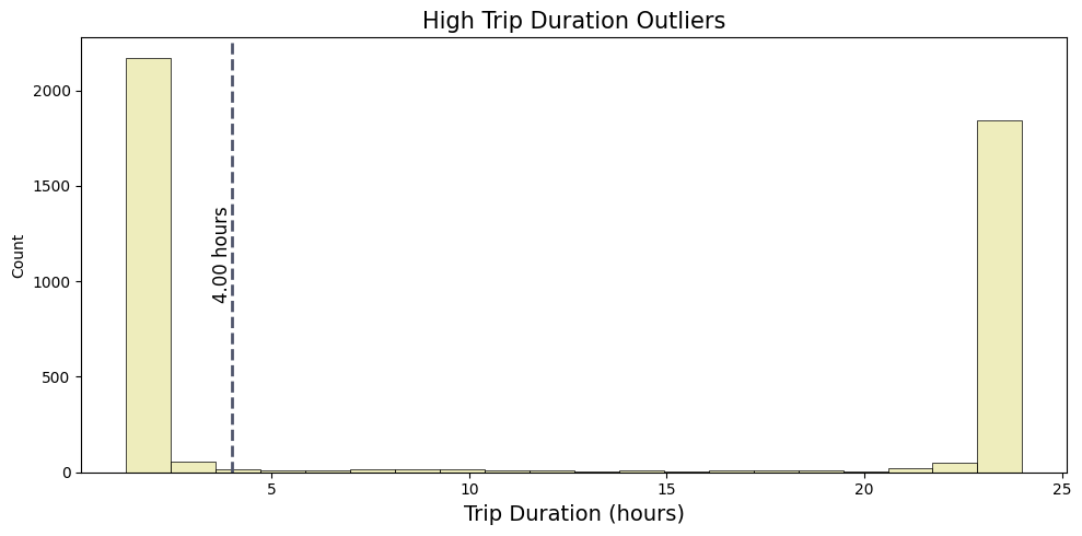
Approximately 0.30% of all trips have durations of 1.32 hours or less. In this case, a table alone does not give much information about these potential outliers; therefore, we employ a histogram to better visualize these potential upper outliers.
From the histogram, it is apparent that around 1700 trips have durations exceeding 20 hours. In contrast, a larger cluster of over 2000 trips has durations ranging between 1.32 hours and 4 hours. Considering this distribution, only those with durations longer than 4 hours may be classified as actual outliers, as durations less than 4 hours are within a plausible range for taxi trips in NYC.
upper_outliers = trip_outliers[upper_duration_outliers]['trip_duration'].reset_index(drop=True)/3600

fig, axes = plt.subplots(1, 1, figsize= (10, 5))

sns.histplot(  upper_outliers, bins=20, linewidth=0.5, color=yellow, alpha=0.5)

axes.set_title(f'High Trip Duration Outliers', fontsize=15)
axes.set_xlabel('Trip Duration (hours)', fontsize=14)
axes.axvline(4, color=grey, linestyle='--', alpha=1, lw=2)
y_center = axes.get_ylim()[1] / 2
axes.text(4, y_center, f'{4:.2f} hours',
            fontsize=12, color='black', va='center', ha='right', rotation=90)
plt.tight_layout()
plt.show()
We observed that there are also unrealistic values for geodesic_distance. These unrealistic values can simple be deleted because they don’t represent a real patters for the trip duration. We’ll create variables to hold boolean series for each of the identified outliers conditions:
# Percentage of lower duration outliers
per_lower_duration = lower_duration_outliers.sum() / len(trip_outliers) * 100
print(f'\nOutliers with trip duration less than 1.4 minutes: {lower_duration_outliers.sum()} '
      f'({per_lower_duration:.2f}% of the dataset)')


# Boolean series for trip durations over 4 hours
upper_duration_outliers = trip_outliers['trip_duration'] > 4 * 3600
per_upper_duration = upper_duration_outliers.sum() / len(trip_outliers) * 100

print(f'\nOutliers with trip duration greater than 4 hours: {upper_duration_outliers.sum()} '
      f'({per_upper_duration:.2f}% of the dataset)')


# Boolean series for geodesic distance == zero
geodesic_outliers_zeros = (trip_outlier_geodesics['geodesic_distance'] == 0)
# Percentage of outliers
per_geodesic = geodesic_outliers_zeros.sum() / len(taxi_trip) * 100

print(f'\nOutliers with zero geodesic distances: {geodesic_outliers_zeros.sum()} '
      f'({per_geodesic:.2f}% of the dataset)')
Outliers with trip duration less than 1.4 minutes: 14461 (1.00% of the dataset)

Outliers with trip duration greater than 4 hours: 2059 (0.14% of the dataset)

Outliers with zero geodesic distances: 5490 (0.38% of the dataset)
Average Geodesic Velocity
Before removing all this outliers that we identify, let’s first investigate one more aspect of the trip duration. As direct observations may not be sufficient to identify all outliers, we can calculate an average velocity based on the geodesic distances to provide a better understanding of potential outliers.
# Calculate the average velocity in Km/h
geo_distance_km = trip_outlier_geodesics['geodesic_distance']/1000
trip_duration_hrs = trip_outlier_geodesics['trip_duration']/3600
velocity_geodesic_kmh = (geo_distance_km) / (trip_duration_hrs)

# For simplicity add velocity to the dataset
trip_outlier_geodesics['avg_velocity_kmh'] = velocity_geodesic_kmh


fig, (ax1, ax2) = plt.subplots(1, 2, figsize=(15, 8))
plot_distribution_boxplot(  trip_outlier_geodesics['avg_velocity_kmh'], ax1, ax2,
                            'Average Geodesic Velocity',
                            'Log of Average Velocity (Km/h)'    )
plt.tight_layout()
plt.show()


log_velocity_geodesic = np.log1p(velocity_geodesic_kmh)
upper_vel_outliers, lower_vel_outliers = count_outliers(log_velocity_geodesic)
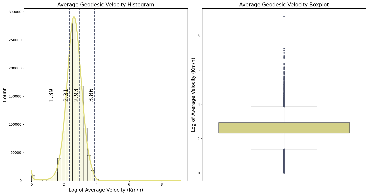
Potential upper outliers: 4950 (0.34% of the dataset)

Potential lower outliers: 23999 (1.65% of the dataset)
The lower and upper values for potential outliers are:
- Lower whisker : ${\exp(1.39) - 1} \approx 3.0 ~~ km/h $
- Upper whisker : ${\exp(3.86) - 1} \approx 46.5 ~~ km/h $
New York City is a metropolis known for its traffic congestion. The average speed of a taxi in New York City with passengers on board is 20.3 km/h, as reported in the article “Taxi driver speeding”:
“… The average occupancy speed of taxi drivers in Shanghai (21.3 km/h) was similar to that of NYC (20.3 km/h)”
Considering that approximately 0.35% of the total number of trips have an average velocity greater than or equal to 46.5 km/h, these cases are not representative of typical taxi trips in NYC and thus can be removed.
3.1.1 Handling Outliers
We will now address the outliers identified in the target feature trip_duration using the following steps
-
Remove the
trip_durationless then or equal to 1.4 minutes. This will remove 1.00% of instances from the original dataset. -
Remove the
trip_durationgreater than 4 hours. This will remove 0.14% of instances from the original dataset. -
Remove
geodesic_distanceequal to 0.0 meters. This will remove 0.38% of instances from the original dataset. -
Remove the
trip_durationcorresponding to an average velocity greater than or equal to 46.5 km/h. This will remove 0.34% of instances from the original dataset.
We will use the boolean series previously defined to create a single series that identifies an entry as an outlier if it meets any one of the outlier conditions:
# Combine all outlier conditions
all_outliers =  lower_duration_outliers | upper_duration_outliers \
                | geodesic_outliers_zeros | upper_vel_outliers

not_outliers = ~all_outliers

# filter the original by not_outliers
original_length = len(taxi_trip)

per_outliers = all_outliers.sum()/original_length * 100
print(  f'\nOutliers removed: {all_outliers.sum()} '
        f'({per_outliers:.2f}% of the dataset)')
Outliers removed: 24848 (1.70% of the dataset)
taxi_trip = trip_outliers[not_outliers].copy()


fig, (ax1, ax2) = plt.subplots(1, 2, figsize=(15, 8))
plot_distribution_boxplot(taxi_trip['trip_duration'], ax1, ax2,
                        'Trip Duration', 'Log of Trip Duration (s)')


plt.tight_layout()
plt.show()
# save the dataset
taxi_trip.to_csv('../data/interim/nyc-taxi-trip-2016-remove-outliers.csv', index=False)
3. Feature Engineering
Before splitting the dataset and conducting the exploratory data analysis (EDA), let’s create some new features that will help in the model predictions and in the Exploratory Data Analysis section.
taxi_trip = pd.read_csv('../data/interim/nyc-taxi-trip-2016-remove-outliers.csv',
                        parse_dates= ['pickup_datetime','dropoff_datetime'])
3.1. Datetime Features
Using the pickup time with format YYYY-MM-DD H:M:S, let’s extract features like the year, month, day, hours and minutes for more informative features and also the time of day, day of the week, day of the year to help with possible underlying patters in the data related to specific time intervals. So we will create a total of 8 new features:
# Days in a year: 1-365 (or 366)
taxi_trip['day_of_year'] = taxi_trip['pickup_datetime'].dt.dayofyear
# Day of week: 0-6 (0 for Monday, 6 for Sunday)
taxi_trip['day_of_week'] = taxi_trip['pickup_datetime'].dt.dayofweek
# Hour of the day :0-23
taxi_trip['hour_of_day'] = taxi_trip['pickup_datetime'].dt.hour
# Minutes in a day: 0-1440
taxi_trip['min_of_day'] = (taxi_trip['pickup_datetime'].dt.hour * 60) + taxi_trip['pickup_datetime'].dt.minute

# Date features
taxi_trip['pickup_date'] = taxi_trip['pickup_datetime'].dt.date
taxi_trip['dropoff_date'] = taxi_trip['pickup_datetime'].dt.date
taxi_trip['year'] = taxi_trip['pickup_datetime'].dt.year
taxi_trip['month'] = taxi_trip['pickup_datetime'].dt.month
taxi_trip['day'] = taxi_trip['pickup_datetime'].dt.day
taxi_trip['hour'] = taxi_trip['pickup_datetime'].dt.hour
taxi_trip['minute'] = taxi_trip['pickup_datetime'].dt.minute

# Drop datetime features, they are not necessary anymore
taxi_trip.drop('pickup_datetime', axis=1, inplace=True)
taxi_trip.drop('dropoff_datetime', axis=1, inplace=True)

taxi_trip.head(3)
| id | vendor_id | passenger_count | pickup_longitude | pickup_latitude | dropoff_longitude | dropoff_latitude | store_and_fwd_flag | |
|---|---|---|---|---|---|---|---|---|
| 0 | id2875421 | 2 | 1 | -73.982155 | 40.767937 | -73.964630 | 40.765602 | False |
| 1 | id2377394 | 1 | 1 | -73.980415 | 40.738564 | -73.999481 | 40.731152 | False |
| 2 | id3858529 | 2 | 1 | -73.979027 | 40.763939 | -74.005333 | 40.710087 | False |
| trip_duration | day_of_year | day_of_week | hour_of_day | min_of_day | pickup_date | dropoff_date | year | month | day | hour | minute | |
|---|---|---|---|---|---|---|---|---|---|---|---|---|
| 0 | 455 | 74 | 0 | 17 | 1044 | 2016-03-14 | 2016-03-14 | 2016 | 3 | 14 | 17 | 24 |
| 1 | 663 | 164 | 6 | 0 | 43 | 2016-06-12 | 2016-06-12 | 2016 | 6 | 12 | 0 | 43 |
| 2 | 2124 | 19 | 1 | 11 | 695 | 2016-01-19 | 2016-01-19 | 2016 | 1 | 19 | 11 | 35 |
Another relevant information is weekends and holidays. For this we will use the holiday dataset from kaggle, which contains the New York City holidays for the year of 2016. We will create two new binary features, is_holiday and is_weekend:
holidays = pd.read_csv('../data/raw/nyc-holidays-2016.csv', sep = ';')
display(holidays.head())
| Day | Date | Holiday | |
|---|---|---|---|
| 0 | Friday | January 01 | New Years Day |
| 1 | Monday | January 18 | Martin Luther King Jr. Day |
| 2 | Friday | February 12 | Lincoln's Birthday |
| 3 | Monday | February 15 | Presidents' Day |
| 4 | Sunday | May 08 | Mother's Day |
# Convert to datetime the Date column
holidays['Date'] = pd.to_datetime(holidays['Date'] + ', 2016')

# Extract month and day as numerical values
holidays['month'] = holidays['Date'].dt.month
holidays['day'] = holidays['Date'].dt.day
# Add the is_holiday column
holidays['is_holiday'] = True

# Drop the original columns
holidays.drop(['Date', 'Day', 'Holiday'], axis=1, inplace=True)

# Save the processed holidays dataset
holidays.to_csv('../data/external/nyc-holidays-2016.csv',index=False)

display(holidays.head())
| month | day | is_holiday | |
|---|---|---|---|
| 0 | 1 | 1 | True |
| 1 | 1 | 18 | True |
| 2 | 2 | 12 | True |
| 3 | 2 | 15 | True |
| 4 | 5 | 8 | True |
We will then use the month and day features to merge the taxi trip dataset with the holidays dataset using a left join:
# Merge the taxi data with the holidays data
taxi_trip = taxi_trip.merge(holidays, on=['month', 'day'], how='left')

# Replace NaN values in the is_holiday column with False
taxi_trip['is_holiday'].fillna(False, inplace=True)

# Add the is_weekend column (5:Saturday or 6:Sunday)
taxi_trip['is_weekend'] = taxi_trip['day_of_week'].isin([5, 6])

display(taxi_trip.head())
print('Number of trips in holiday:', taxi_trip[taxi_trip['is_holiday'] == True].shape[0])
| id | vendor_id | passenger_count | pickup_longitude | pickup_latitude | dropoff_longitude | dropoff_latitude | store_and_fwd_flag | |
|---|---|---|---|---|---|---|---|---|
| 0 | id2875421 | 2 | 1 | -73.982155 | 40.767937 | -73.964630 | 40.765602 | False |
| 1 | id2377394 | 1 | 1 | -73.980415 | 40.738564 | -73.999481 | 40.731152 | False |
| 2 | id3858529 | 2 | 1 | -73.979027 | 40.763939 | -74.005333 | 40.710087 | False |
| 3 | id3504673 | 2 | 1 | -74.010040 | 40.719971 | -74.012268 | 40.706718 | False |
| 4 | id2181028 | 2 | 1 | -73.973053 | 40.793209 | -73.972923 | 40.782520 | False |
| trip_duration | day_of_year | min_of_day | pickup_date | dropoff_date | year | month | day | hour | minute | is_holiday | is_weekend | |
|---|---|---|---|---|---|---|---|---|---|---|---|---|
| 0 | 455 | 74 | 1044 | 2016-03-14 | 2016-03-14 | 2016 | 3 | 14 | 17 | 24 | False | False |
| 1 | 663 | 164 | 43 | 2016-06-12 | 2016-06-12 | 2016 | 6 | 12 | 0 | 43 | False | True |
| 2 | 2124 | 19 | 695 | 2016-01-19 | 2016-01-19 | 2016 | 1 | 19 | 11 | 35 | False | False |
| 3 | 429 | 97 | 1172 | 2016-04-06 | 2016-04-06 | 2016 | 4 | 6 | 19 | 32 | False | False |
| 4 | 435 | 86 | 810 | 2016-03-26 | 2016-03-26 | 2016 | 3 | 26 | 13 | 30 | False | True |
Number of trips in holiday: 49736
3.2. Traffic Features
A brief search on Google about New York City’s traffic patterns revealed useful insights from sources such as A Guide to Traffic in NYC and in 10 Tips to Beat NYC Traffic sites. These resources suggest that high traffic times in and out of Manhattan typically occur between 8-9 a.m. and 3-7 p.m. Based on this information, we will create a new feature called is_rush_hour to determine whether the pickup time falls within rush hour on a given day. To simplify, weekends and holidays will be considered as having normal traffic hours throughout the day. Here based on this information and on the Exploratory Data Analysis section, we chose to consider the following time intervals for rush hours: 7-10 a.m. and 4-8 p.m . This feature will be a binary feature that indicates a increase in traffic during the rush hours:
# Define rush hours
morning_rush = (taxi_trip['hour'] >= 7) & (taxi_trip['hour'] < 10)
evening_rush = (taxi_trip['hour'] >= 16) & (taxi_trip['hour'] < 20)

# Weekdays are 0 (Monday) to 4 (Friday)
is_weekday = taxi_trip['day_of_week'] < 5


taxi_trip['is_rush_hour'] = (morning_rush | evening_rush) & is_weekday

display(taxi_trip.head(3))
| id | vendor_id | passenger_count | pickup_longitude | pickup_latitude | dropoff_longitude | dropoff_latitude | store_and_fwd_flag | |
|---|---|---|---|---|---|---|---|---|
| 0 | id2875421 | 2 | 1 | -73.982155 | 40.767937 | -73.964630 | 40.765602 | False |
| 1 | id2377394 | 1 | 1 | -73.980415 | 40.738564 | -73.999481 | 40.731152 | False |
| 2 | id3858529 | 2 | 1 | -73.979027 | 40.763939 | -74.005333 | 40.710087 | False |
| trip_duration | day_of_year | pickup_date | dropoff_date | year | month | day | hour | minute | is_holiday | is_weekend | is_rush_hour | |
|---|---|---|---|---|---|---|---|---|---|---|---|---|
| 0 | 455 | 74 | 2016-03-14 | 2016-03-14 | 2016 | 3 | 14 | 17 | 24 | False | False | True |
| 1 | 663 | 164 | 2016-06-12 | 2016-06-12 | 2016 | 6 | 12 | 0 | 43 | False | True | False |
| 2 | 2124 | 19 | 2016-01-19 | 2016-01-19 | 2016 | 1 | 19 | 11 | 35 | False | False | False |
3.3. Distance Features
In an article on New York City taxi trip duration prediction using MLP and XGBoost, as discussed in the outliers section, some distance measures were discussed, like Manhattan, haversine, and bearing distances.
For this project, I will adopt a simplified approach that still accounts for the Earth’s curvature. This will involve calculating the geodesic distance using the geopy library and computing the bearing distance. The bearing distance measures the angle between the north line and the line connecting the pickup and dropoff locations.
# Again lets use the function geodesic to create new features
taxi_trip['geodesic_distance'] = geodesic(  taxi_trip['pickup_latitude'].to_numpy(),
                                            taxi_trip['pickup_longitude'].to_numpy(),
                                            taxi_trip['dropoff_latitude'].to_numpy(),
                                            taxi_trip['dropoff_longitude'].to_numpy())
def bearing(start_lat, start_lon, end_lat, end_lon):
    """
    Calculate the initial bearing (azimuth) between two sets of latitude and longitude coordinates.

    Args:
    - start_lat (float): Latitude of the starting point in degrees.
    - start_lon (float): Longitude of the starting point in degrees.
    - end_lat (float): Latitude of the ending point in degrees.
    - end_lon (float): Longitude of the ending point in degrees.

    Returns:
    float: The initial bearing in degrees, normalized to the range [0, 360).
    """

    # Convert latitude and longitude from degrees to radians
    start_lat, start_lon, end_lat, end_lon = map(np.radians, [start_lat, start_lon, end_lat, end_lon])

    # Calculate the change in coordinates
    dlon = end_lon - start_lon

    # Calculate bearing
    x = np.sin(dlon) * np.cos(end_lat)
    y = np.cos(start_lat) * np.sin(end_lat) - np.sin(start_lat) * np.cos(end_lat) * np.cos(dlon)
    initial_bearing = np.arctan2(x, y)

    # Convert from radians to degrees and normalize (0-360)
    initial_bearing = np.degrees(initial_bearing)
    bearing = (initial_bearing + 360) % 360

    return bearing
# create bearing feature
taxi_trip['bearing'] = bearing( taxi_trip['pickup_latitude'], taxi_trip['pickup_longitude'],
                                taxi_trip['dropoff_latitude'], taxi_trip['dropoff_longitude'])


display(taxi_trip.head(3))
| id | vendor_id | passenger_count | pickup_longitude | pickup_latitude | dropoff_longitude | dropoff_latitude | store_and_fwd_flag | |
|---|---|---|---|---|---|---|---|---|
| 0 | id2875421 | 2 | 1 | -73.982155 | 40.767937 | -73.964630 | 40.765602 | False |
| 1 | id2377394 | 1 | 1 | -73.980415 | 40.738564 | -73.999481 | 40.731152 | False |
| 2 | id3858529 | 2 | 1 | -73.979027 | 40.763939 | -74.005333 | 40.710087 | False |
| trip_duration | day_of_year | year | month | day | hour | minute | is_holiday | is_weekend | is_rush_hour | geodesic_distance | bearing | |
|---|---|---|---|---|---|---|---|---|---|---|---|---|
| 0 | 455 | 74 | 2016 | 3 | 14 | 17 | 24 | False | False | True | 1502.171837 | 99.970196 |
| 1 | 663 | 164 | 2016 | 6 | 12 | 0 | 43 | False | True | False | 1808.659969 | 242.846232 |
| 2 | 2124 | 19 | 2016 | 1 | 19 | 11 | 35 | False | False | False | 6379.687175 | 200.319835 |
3.4. Weather Features
Even small weather changes, like rain or snow, can significantly affect traffic and transportation patterns in a large city. Rain or snow can impact driving conditions, increase traffic congestion, and influence public transportation usage, leading to longer taxi trip times and potentially higher demand for taxis. Therefore, we will use the weather dataset from kaggle. This dataset includes information on temperature, precipitation, visibility, and other relevant weather metrics. We plan to integrate this data with our taxi trip dataset by merging them based on date and time as we did before with the holidays dataset.
weather = pd.read_csv('../data/raw/nyc-weather-2016.csv', parse_dates=['Time'])
display(weather.head(3))
| Time | Temp. | Windchill | Heat Index | Humidity | Pressure | Dew Point | Visibility | Wind Dir | Wind Speed | Gust Speed | Precip | Events | Conditions | |
|---|---|---|---|---|---|---|---|---|---|---|---|---|---|---|
| 0 | 2015-12-31 02:00:00 | 7.8 | 7.1 | NaN | 0.89 | 1017.0 | 6.1 | 8.0 | NNE | 5.6 | 0.0 | 0.8 | NaN | Overcast |
| 1 | 2015-12-31 03:00:00 | 7.2 | 5.9 | NaN | 0.90 | 1016.5 | 5.6 | 12.9 | Variable | 7.4 | 0.0 | 0.3 | NaN | Overcast |
| 2 | 2015-12-31 04:00:00 | 7.2 | NaN | NaN | 0.90 | 1016.7 | 5.6 | 12.9 | Calm | 0.0 | 0.0 | 0.0 | NaN | Overcast |
The weather dataset shows some missing values in features like Windchill, Heat Index, Pressure, and Visibility. For our analysis, Visibility is a critical feature due to its potential impact on driving conditions. The missing values in Windchill and Heat Index are not a concern for our study, as these factors are less directly related to traffic patterns. Other relevant features for our analysis, such as Conditions and Temp. have no missing values, and we do not need to worry.
# Checking for missing values, data types and duplicates:
print('duplicated values:', weather.duplicated().sum())
print('\n')
display(weather.info())
print('\n')
display(weather.isnull().sum())
duplicated values: 0


<class 'pandas.core.frame.DataFrame'>
RangeIndex: 8787 entries, 0 to 8786
Data columns (total 14 columns):
 #   Column      Non-Null Count  Dtype
---  ------      --------------  -----
 0   Time        8787 non-null   datetime64[ns]
 1   Temp.       8787 non-null   float64
 2   Windchill   2295 non-null   float64
 3   Heat Index  815 non-null    float64
 4   Humidity    8787 non-null   float64
 5   Pressure    8556 non-null   float64
 6   Dew Point   8787 non-null   float64
 7   Visibility  8550 non-null   float64
 8   Wind Dir    8787 non-null   object
 9   Wind Speed  8787 non-null   float64
 10  Gust Speed  8787 non-null   float64
 11  Precip      8787 non-null   float64
 12  Events      455 non-null    object
 13  Conditions  8787 non-null   object
dtypes: datetime64[ns](1), float64(10), object(3)
memory usage: 961.2+ KB


None


Time             0
Temp.            0
Windchill     6492
Heat Index    7972
Humidity         0
Pressure       231
Dew Point        0
Visibility     237
Wind Dir         0
Wind Speed       0
Gust Speed       0
Precip           0
Events        8332
Conditions       0
dtype: int64
The feature Conditions is a categorical feature that describes the weather conditions at the time of the observation. the feature have the following unique values of categorical data:
print(weather['Conditions'].unique())
['Overcast' 'Clear' 'Partly Cloudy' 'Mostly Cloudy' 'Scattered Clouds'
 'Unknown' 'Light Rain' 'Haze' 'Rain' 'Heavy Rain' 'Light Snow' 'Snow'
 'Heavy Snow' 'Light Freezing Fog' 'Light Freezing Rain' 'Fog']
This features can be used to create new binary features that indicate the presence of a specific weather condition. We can create new features as snow, heavy_snow, rain, heavy_rain that indicates whether it was snowing or raining at the time of the observation. to create this features, we first group the Conditions feature into 4 categories:
-
Snow: Light Snow, Snow
-
Heavy Snow: Heavy Snow,Lightning freezing fog, Fog
-
Rain: Light Rain, Rain
-
Heavy Rain: Heavy Rain, Light Freezing Rain
The idea to group the conditions this way is to consider the conditions that can impact the traffic in a similar way. For example, I add Fog in Heavy Snow because it can affect the visibility in a similar way. The same for Light Freezing Rain and Heavy Rain.
To integrate weather data into the dataset of taxi trip, we must first preprocessed the weather dataset to align it with the taxi trip dataset. Let’s separate the date and time into different columns for year, month, day, hour.
weather['year'] = weather['Time'].dt.year
weather['month'] = weather['Time'].dt.month
weather['day'] = weather['Time'].dt.day
weather['hour'] = weather['Time'].dt.hour

# Select only the year of 2016
weather = weather[(weather['year'] == 2016)]

# Select only the months that have in the taxi dataset
months_taxi_trip = taxi_trip['month'].unique()
select_month = weather['month'].isin(months_taxi_trip)
weather = weather[select_month]


# Create new features based in the conditions column
snow = (weather['Conditions'] == 'Light Snow') | (weather['Conditions'] == 'Snow')
heavy_snow = (weather['Conditions'] == 'Heavy Snow') | (weather['Conditions'] == 'Light Freezing Fog')\
                                                    | (weather['Conditions'] == 'Fog')

rain = (weather['Conditions'] == 'Light Rain') | (weather['Conditions'] == 'Rain')
heavy_rain = (weather['Conditions'] == 'Heavy Rain') | (weather['Conditions'] == 'Light Freezing Rain')

weather['snow'] = snow
weather['heavy_snow'] = heavy_snow
weather['rain'] = rain
weather['heavy_rain'] = heavy_rain

# Drop the features that are not needed
weather.drop([ 'Time', 'Windchill', 'Heat Index', 'Humidity', 'Pressure', 'Dew Point', 'Wind Dir',
                'Wind Speed', 'Events', 'Conditions', 'Gust Speed'], axis=1, inplace=True)

# Rename columns to lowercase as in the taxi dataset
weather.rename(columns={'Temp.': 'temperature'}, inplace=True)
weather.rename(columns={'Visibility': 'visibility'}, inplace=True)
weather.rename(columns={'Precip': 'precipitation'}, inplace=True)

display(weather.head(3))
| temperature | visibility | precipitation | year | month | day | hour | snow | heavy_snow | rain | heavy_rain | |
|---|---|---|---|---|---|---|---|---|---|---|---|
| 22 | 5.6 | 16.1 | 0.0 | 2016 | 1 | 1 | 0 | False | False | False | False |
| 23 | 5.6 | 16.1 | 0.0 | 2016 | 1 | 1 | 1 | False | False | False | False |
| 24 | 5.6 | 16.1 | 0.0 | 2016 | 1 | 1 | 2 | False | False | False | False |
We can check the maximum and minimum values for each feature to see if there is any inconsistency. As shown below, all features appear to be consistent with the range of values expected for each feature.
# max and min values
display(weather.describe().loc[['min', 'max']])
| temperature | visibility | precipitation | year | month | day | hour | |
|---|---|---|---|---|---|---|---|
| min | -18.3 | 0.4 | 0.0 | 2016.0 | 1.0 | 1.0 | 0.0 |
| max | 32.2 | 16.1 | 11.9 | 2016.0 | 6.0 | 31.0 | 23.0 |
Missing values
We need to handle the missing values in visibility. This feature has values approximately between 0-16, where 0 indicates the worse visibility and 16 the best visibility.
print('Unique values for visibility:\n', weather['visibility'].unique())
print('\n')
display(weather.isna().sum().head())
Unique values for visibility:
 [16.1  nan 14.5  8.  12.9 11.3  6.4  4.8  2.4  2.8  2.   4.   3.2  9.7
  1.2  0.8  1.6  0.4]


temperature        0
visibility       132
precipitation      0
year               0
month              0
dtype: int64
To better understand the nature of the missing values, let’s create a table that correlates these missing values with different weather conditions. The missing values do not appear randomly distributed, they occur when the weather condition is good. To visualize this we can create a table that shows the number of NaN values in visibility named is_visibility_nan by the total number of days snowing and raining :
is_visibility_nan = weather['visibility'].isna()

weather_summary = pd.DataFrame({
    'is_visibility_nan': is_visibility_nan,
    '#snowing_days': snow,
    '#heavy_snowing_days': heavy_snow,
    '#raining_days': rain,
    '#heavy_raining_days': heavy_rain})

# Group by 'Visibility NaN' and calculate the sum for each weather condition
summary = weather_summary.groupby('is_visibility_nan').sum()

summary['total_counts'] =  is_visibility_nan.value_counts().values

# Reset index to turn 'Visibility NaN' back into a column
summary = summary.reset_index()


display(summary)
| is_visibility_nan | #snowing_days | #heavy_snowing_days | #raining_days | #heavy_raining_days | total_counts | |
|---|---|---|---|---|---|---|
| 0 | False | 61 | 6 | 171 | 10 | 4200 |
| 1 | True | 0 | 0 | 0 | 0 | 132 |
When is_visibility_nan is True (visibility data is missing), there are 132 days in total, and notably, none of these days are recorded as having snowing, heavy snowing, raining, or heavy raining conditions. This absence of precipitation-related weather conditions on days with missing visibility data suggests that visibility tends to be unrecorded primarily on days with good or clear weather.
This could make sense, as maybe under clear conditions, they overlook recording some values. Therefore, we can logically fill the missing values with the maximum value of visibility.
weather['visibility'].fillna(weather['visibility'].max(), inplace=True)
print("Missing values in visibility: ",weather['visibility'].isna().sum())
Missing values in visibility: 0
We will use the combination of year, month, day, hour features to merge the taxi trip dataset with the weather dataset using a left join:
taxi_trip_merge = taxi_trip.merge(weather, on=['year','month', 'day', 'hour'], how='left')

display(taxi_trip_merge.isna().sum().tail(10))

# Save the weather dataset
weather.to_csv('../data/external/nyc-weather-2016.csv', index=False)
is_rush_hour             0
geodesic_distance        0
bearing                  0
temperature          11751
visibility           11751
precipitation        11751
snow                 11751
heavy_snow           11751
rain                 11751
heavy_rain           11751
dtype: int64
After merging the two datasets, we can see that there are some missing dates in the weather dataset, causing 11751 missing values for the weather features. This is less then 1% of our entire dataset, so we can take a more simplified approach by dropping these rows:
taxi_trip = taxi_trip_merge.dropna().copy()

print('Old size:',taxi_trip_merge.shape[0])

print('\nNew size:',taxi_trip.shape[0])

display(taxi_trip.head(3))
Old size: 1427156

New size: 1415405
| id | vendor_id | passenger_count | pickup_longitude | pickup_latitude | dropoff_longitude | dropoff_latitude | store_and_fwd_flag | |
|---|---|---|---|---|---|---|---|---|
| 0 | id2875421 | 2 | 1 | -73.982155 | 40.767937 | -73.964630 | 40.765602 | False |
| 1 | id2377394 | 1 | 1 | -73.980415 | 40.738564 | -73.999481 | 40.731152 | False |
| 2 | id3858529 | 2 | 1 | -73.979027 | 40.763939 | -74.005333 | 40.710087 | False |
| trip_duration | day_of_year | is_rush_hour | geodesic_distance | bearing | temperature | visibility | precipitation | snow | heavy_snow | rain | heavy_rain | |
|---|---|---|---|---|---|---|---|---|---|---|---|---|
| 0 | 455 | 74 | True | 1502.171837 | 99.970196 | 4.4 | 8.0 | 0.3 | False | False | False | False |
| 1 | 663 | 164 | False | 1808.659969 | 242.846232 | 28.9 | 16.1 | 0.0 | False | False | False | False |
| 2 | 2124 | 19 | False | 6379.687175 | 200.319835 | -6.7 | 16.1 | 0.0 | False | False | False | False |
3.5 Cluster Features
Here we will use the mini-batch k-means algorithm to cluster the pickup and dropoff locations into 100 clusters. We will then use the cluster centers to create new features that represent the distance between the pickup and dropoff locations and the cluster centers. This can help the model to identify patterns in the data related to the cluster centers.
def plot_clusters_map(  df, gdf_map, latitude_col, longitude_col, cluster_col, ax,
                        title=' ', sample_size=0, color_map= 'beige', edgecolor= 'grey',
                        random_state=42, cmap='tab20', alpha=0.2):

    """
    Plots a geographical map with clusters from a DataFrame.

    Parameters:
    - df: DataFrame containing the data to be plotted.
    - gdf_map: GeoDataFrame representing the geographical boundaries.
    - latitude_col: Name of the column containing latitude data.
    - longitude_col: Name of the column containing longitude data.
    - cluster_col: Name of the column containing cluster identifiers.
    - ax: Matplotlib Axes object for plotting.
    - title: Title of the plot.
    - sample_size: Number of data points to sample from df (0 for all).
    - color_map: Color for the map.
    - edgecolor: Edge color for the map.
    - random_state: Random state for reproducibility in sampling.
    - cmap: Colormap for clusters.
    - alpha: Transparency level for cluster points.
    """


    if sample_size > 0:
        df = df.sample(sample_size, random_state=random_state)

    # Create geometry and GeoDataFrame
    geometry = gpd.points_from_xy(df[longitude_col], df[latitude_col])
    gdf_clusters = gpd.GeoDataFrame(df, geometry=geometry).set_crs(epsg=4326)

    # Convert map to the same CRS
    gdf_map = gdf_map.to_crs(epsg=4326)
    gdf_map.plot(ax=ax, color=color_map, edgecolor=edgecolor)  # Plot the NYC boundary

    # Scatter plot for clusters
    ax.scatter( gdf_clusters.geometry.x, gdf_clusters.geometry.y, s=1,
                c=df[cluster_col].values, cmap=cmap, alpha=alpha)  # Plot clusters

    # Set labels and title
    ax.set_xlabel('Longitude', fontsize=14)
    ax.set_ylabel('Latitude', fontsize=14)
    ax.set_title(title, fontsize=20)
Let’s create more six features based in the results of the mini-batch k-means algorithm. We will create two features for the predict clusters, one for pickup and one for dropoff locations. From this features we extract the longitude and latitude centers of each cluster, creating four features: pickup_center_lat, pickup_center_long, dropoff_center_lat, dropoff_center_long. We will also create two features for the distance between the pickup and dropoff cluster centers, pickup_cluster_distance and dropoff_cluster_distance.
pickup_locations = taxi_trip.loc[:,['pickup_latitude', 'pickup_longitude']]
dropoff_locations = taxi_trip.loc[:,['dropoff_latitude', 'dropoff_longitude']]


coords = np.vstack( [pickup_locations.values, dropoff_locations.values])

# Randomly permute the combined coordinates
sample_coords = np.random.permutation(coords)[:500000]


kmeans_coords = MiniBatchKMeans(    n_clusters= 100 , random_state=42,
                                    batch_size=10000, n_init = 'auto')

kmeans_coords.fit(sample_coords)


# Predict clusters for the full dataset
taxi_trip['pickup_cluster'] = kmeans_coords.predict(pickup_locations.values)
taxi_trip['dropoff_cluster'] = kmeans_coords.predict(dropoff_locations.values)

cluster_centers = kmeans_coords.cluster_centers_
taxi_trip['pickup_center_lat'] = cluster_centers[taxi_trip['pickup_cluster'], 0]
taxi_trip['pickup_center_lon'] = cluster_centers[taxi_trip['pickup_cluster'], 1]
taxi_trip['dropoff_center_lat'] = cluster_centers[taxi_trip['dropoff_cluster'], 0]
taxi_trip['dropoff_center_lon'] = cluster_centers[taxi_trip['dropoff_cluster'], 1]

# Calculate the geodesic distance
taxi_trip['center_geodesic_distances'] = geodesic(  taxi_trip['pickup_center_lat'].to_numpy(),
                                                    taxi_trip['pickup_center_lon'].to_numpy(),
                                                    taxi_trip['dropoff_center_lat'].to_numpy(),
                                                    taxi_trip['dropoff_center_lon'].to_numpy())

taxi_trip[['center_geodesic_distances', 'geodesic_distance']].head()
| center_geodesic_distances | geodesic_distance | |
|---|---|---|
| 0 | 1381.650448 | 1502.171837 |
| 1 | 1909.482823 | 1808.659969 |
| 2 | 6462.250705 | 6379.687175 |
| 3 | 1864.313219 | 1483.632481 |
| 4 | 844.527437 | 1187.037659 |
For a visualization, we can plot the clusters using the shape file from NYC Borough Boundaries and the cluster centers:
fig, axes = plt.subplots(1, 2, figsize=(24, 16))
titles = ['Pickup Locations', 'Dropoff Locations']
# Column names
location_columns = [('pickup_latitude', 'pickup_longitude', 'pickup_cluster'),
                    ('dropoff_latitude', 'dropoff_longitude', 'dropoff_cluster')]

# Loop through each subplot
for ax, title, (lat_col, lon_col, cluster_col) in zip(axes, titles, location_columns):
    plot_clusters_map(  taxi_trip, nyc_boundary, lat_col, lon_col, cluster_col, ax,
                        title=title, color_map= beige, edgecolor=grey)

    # Plot the cluster centers
    ax.scatter( cluster_centers[:, 1], cluster_centers[:, 0], s = 3,
                c = 'black', marker='*', alpha = 0.7)

plt.show()
# Save the dataset
taxi_trip.to_csv('../data/interim/nyc-taxi-trip-2016-new-features.csv', index=False)
4. Split Dataset
taxi_trip = pd.read_csv('../data/interim/nyc-taxi-trip-2016-new-features.csv',
                        parse_dates= ['pickup_date','dropoff_date'])
Let’s choose to split the dataset first into two parts, df_train_large and df_test. The df_train_large will be used for exploratory data analysis (EDA) to understand the dataset deeply and identify key features. Then, using the df_train_large dataset, we will split it again into df_train and df_val. The df_train will be used to train our machine learning models and validate their prediction with the df_val dataset. The df_test set, is reserved until the end, and will provide an unbiased assessment of the model’s performance on unseen data, preventing any kind of data leakage. Also, we will use the df_train_large to compare the performance with the df_test set.
# Split in 35.75% Train /29.25% Validation/ 35% Test
df_train_large, df_test = train_test_split(taxi_trip, test_size = 0.40, random_state = random_state)
df_train, df_val = train_test_split(df_train_large, train_size = 0.55, random_state = random_state)

print(f"Train large:{len(df_train_large)}({round(100*len(df_train_large)/ len(taxi_trip), 2)}%)")
print(f"Test: {len(df_test)}({round(100*len(df_test)/len(taxi_trip),2)}%)")
print(f"Train:{len(df_train)}({round(100*len(df_train)/len(taxi_trip),2)}%)")
print(f"Validation: {len(df_val)}({round(100*len(df_val)/len(taxi_trip),2)}%)")
Train large:849243(60.0%)
Test: 566162(40.0%)
Train:467083(33.0%)
Validation: 382160(27.0%)
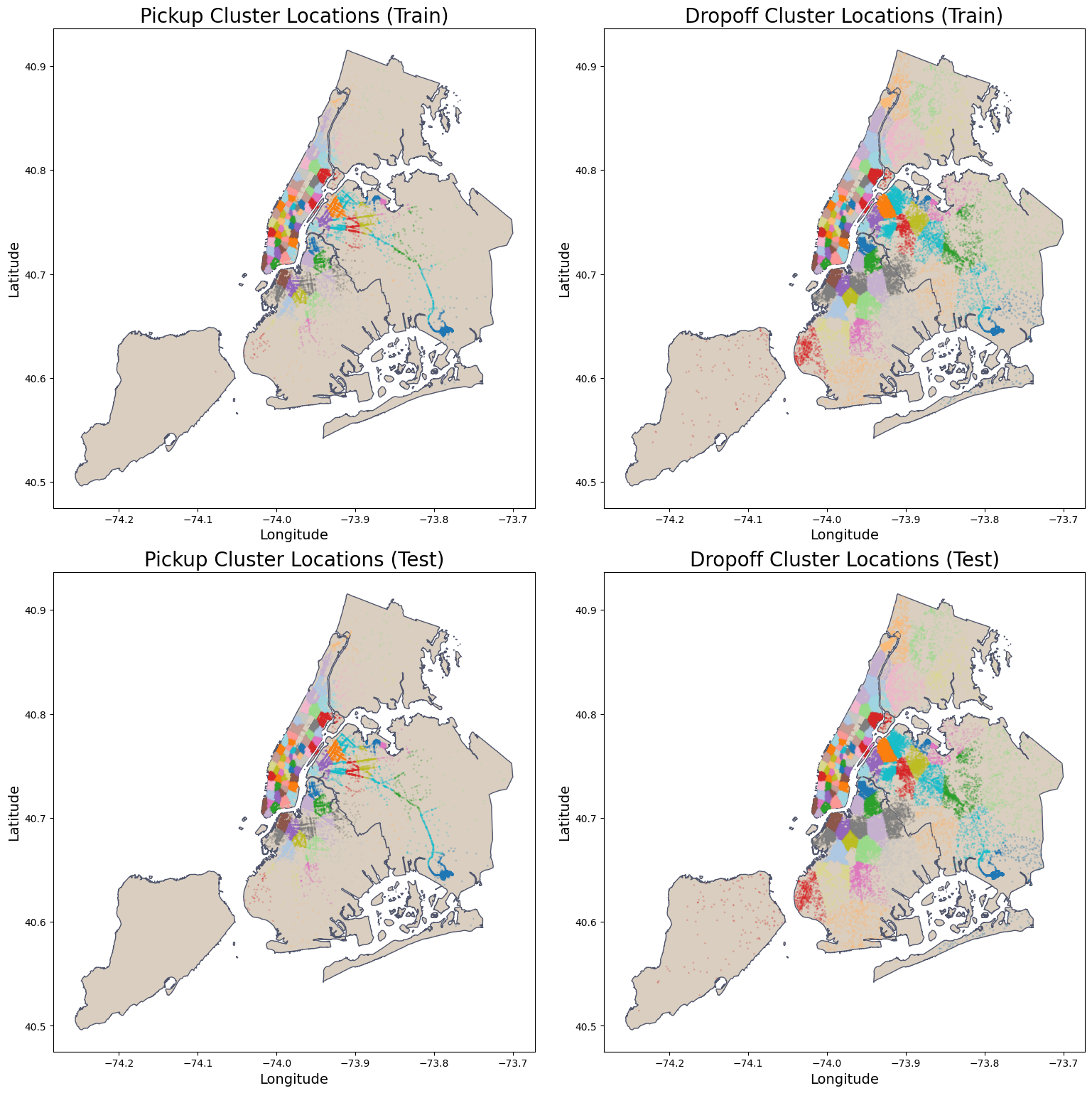
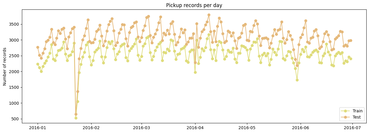
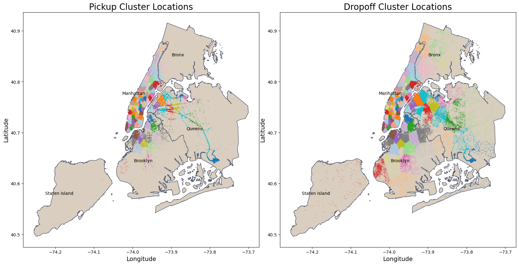
Also, to visualize the split data and check if the spatial and temporal features are representative in each dataset, we plot the NYC map for the pickup and dropoff locations clusters and the counts of pickup by the dates. We can see that the split is representative for the spatial and temporal features:
nybb_path = '../data/external/nyc-borough-boundaries/geo_export_e13eede4-6de2-4ed8-98a0-58290fd6b0fa.shp'
nyc_boundary = gpd.read_file(nybb_path)

fig, axes = plt.subplots(2, 2, figsize=(20, 16))
axes = axes.flatten()  # Flatten the axes array for easy iteration

# Titles and Column names
titles = ['Pickup Cluster Locations', 'Dropoff Cluster Locations']
# Column names
location_columns = [('pickup_latitude', 'pickup_longitude', 'pickup_cluster'),
                    ('dropoff_latitude', 'dropoff_longitude', 'dropoff_cluster')]

# Loop for training data
for ax, title, (lat_col, lon_col, cluster_col) in zip(axes[:2], titles, location_columns):
    plot_clusters_map(  df_train, nyc_boundary, lat_col, lon_col, cluster_col, ax,
                        title=title + ' (Train)', color_map= beige, edgecolor=grey)

# Loop for test data
for ax, title, (lat_col, lon_col, cluster_col) in zip(axes[2:], titles, location_columns):
    plot_clusters_map(  df_test, nyc_boundary, lat_col, lon_col, cluster_col, ax,
                        title=title + ' (Test)', color_map= beige, edgecolor=grey)

plt.tight_layout()
plt.subplots_adjust(left=0.10, right=0.90, top=0.95, bottom=0.05)
plt.show()
fig, axes = plt.subplots(1, 1, figsize=(15, 5))

axes.plot(df_train.groupby('pickup_date')[['id']].agg(['count']), 'o-' , label = "Train", color = yellow)
axes.plot(df_test.groupby('pickup_date')[['id']].agg(['count']), 'o-', label = "Test", color = orange)

plt.title('Pickup records per day')
plt.legend(loc ='lower right')
plt.ylabel('Number of records')
plt.show()
5. Exploratory Data Analysis (EDA)
We proceed with the EDA in the df_train_large dataset, which is the combination of both training and validation sets. To prevent data leakage, we don’t include the test set for the EDA. This will ensure the trained model evaluation on the test set is unbiased, without information from the train set mistakenly leakage to the test.
5.1 Feature Visualizations
Let’s first plot one more time the maps of NYC pickup and dropoff cluster locations. We can see that for both the clusters are concentrated in Manhattan. The main difference between pickup and dropoff locations is the concentration of the clusters outside Manhattan. For dropoff locations, are also more concentration in other regions like in Brooklyn and Queens, when compared to the pickup locations. This is expected because Manhattan is a commercial and financial center of the United States, and Brooklyn and Queens are residential boroughs.
nybb_path = '../data/external/nyc-borough-boundaries/geo_export_e13eede4-6de2-4ed8-98a0-58290fd6b0fa.shp'
nyc_boundary = gpd.read_file(nybb_path)

fig, axes = plt.subplots(1, 2, figsize=(20, 16))
axes = axes.flatten()

titles = ['Pickup Cluster Locations', 'Dropoff Cluster Locations']
location_columns = [('pickup_latitude', 'pickup_longitude', 'pickup_cluster'),
                    ('dropoff_latitude', 'dropoff_longitude', 'dropoff_cluster')]

for ax, title, (lat_col, lon_col, cluster_col) in zip(axes[:2], titles, location_columns):
    plot_clusters_map(  df_train_large, nyc_boundary, lat_col, lon_col, cluster_col, ax,
                        title=title, color_map = beige , edgecolor=grey)

    # iterrows: Loop through each row in the DataFrame.
    # return index of each row
    # return each row as pandas series
    for idx, row in nyc_boundary.iterrows():
        centroid = row['geometry'].centroid
        ax.text(centroid.x, centroid.y, row['boro_name'], fontsize=10, ha='right', va='center')

plt.tight_layout()
plt.subplots_adjust(left=0.10, right=0.90, top=0.95, bottom=0.05)
plt.show()
Let’s look at a simple overview visualization of the pickup and dropoff latitudes and longitudes:
fig, axes = plt.subplots(2, 2, figsize=(20, 10))  # 2x2 grid for subplots

# Pickup Longitude Histogram
sns.histplot(   df_train_large.pickup_longitude, bins=40, linewidth=0.5, color=yellow, alpha=0.2,
                ax=axes[0, 0], kde=True, line_kws={'lw': 3})
axes[0, 0].set_title('Pickup Longitude', fontsize=15)
axes[0, 0].set_xlabel('Pickup Longitude', fontsize=14)
axes[0, 0].set_ylabel('Count', fontsize=14)

# Pickup Latitude Histogram
sns.histplot( df_train_large.pickup_latitude, bins=40, linewidth=0.5, color=yellow, alpha=0.2,
                ax=axes[0, 1], kde=True, line_kws={'lw': 3})
axes[0, 1].set_title('Pickup Latitude', fontsize=15)
axes[0, 1].set_xlabel('Pickup Latitude', fontsize=14)
axes[0, 1].set_ylabel('Count', fontsize=14)

# Dropoff Longitude Histogram
sns.histplot(  df_train_large.dropoff_longitude, bins=40, linewidth=0.5, color=orange, alpha=0.2,
                ax=axes[1, 0], kde=True, line_kws={'lw': 3})
axes[1, 0].set_title('Dropoff Longitude', fontsize=15)
axes[1, 0].set_xlabel('Dropoff Longitude', fontsize=14)
axes[1, 0].set_ylabel('Count', fontsize=14)

# Dropoff Latitude Histogram
sns.histplot(   df_train_large.dropoff_latitude, bins=40, linewidth=0.5, color=orange, alpha=0.2,
                ax=axes[1, 1], kde=True, line_kws={'lw': 3})
axes[1, 1].set_title('Dropoff Latitude', fontsize=15)
axes[1, 1].set_xlabel('Dropoff Latitude', fontsize=14)
axes[1, 1].set_ylabel('Count', fontsize=14)

plt.tight_layout()
plt.show()
For the bearing feature created in the 3. Feature Engineering section, we visualized the bearing feature’s distribution using a histogram in polar coordinates. The radial variable is the geodesic distance in log scale and the polar variable is the bearing angles in degrees. On the left we plot the histogram for the bearing in cartesian coordinates, and On the right we plot the histogram in polar coordinates.
fig = plt.figure(figsize=(20, 8))

# Add a regular subplot for the linear histogram of bearing
ax1 = fig.add_subplot(121)  # 1 row, 2 columns, first subplot
sns.histplot(   df_train_large['bearing'], bins=40, linewidth=0.2, color=yellow, alpha=0.2,
                ax=ax1, kde=True, line_kws={'lw': 3})
ax1.set_title('Bearing Histogram', fontsize=15)
ax1.set_xlabel('Bearing (Degrees)', fontsize=14)
ax1.set_ylabel('Count', fontsize=14)

# Add a polar subplot for the 2D histogram
ax2 = fig.add_subplot(122, projection='polar')  # 1 row, 2 columns, second subplot with polar projection

# Convert bearing to radians
bearing_rad = np.radians(df_train_large['bearing'])

# Create a 2D histogram in polar coordinates
hist, theta, r, mappable = ax2.hist2d(  bearing_rad,
                                        np.log10(df_train_large['geodesic_distance']),
                                        bins=[20, 20],
                                        cmap='YlOrBr')

# Customize the polar plot
ax2.set_theta_zero_location('N')  # Set 0 degrees to the south
ax2.set_theta_direction(-1)  # Clockwise
ax2.set_xlabel('Bearing (Degrees)', fontsize=14, labelpad=20)
ax2.set_ylabel('Log10 of Geodesic Distance (m)', fontsize=14, labelpad=40)
ax2.grid(True)

# Add a color bar to represent counts on the polar plot
cbar = plt.colorbar(mappable, ax=ax2, pad=0.1, fraction=0.035)
cbar.ax.set_ylabel('Counts')

plt.tight_layout()
plt.show()
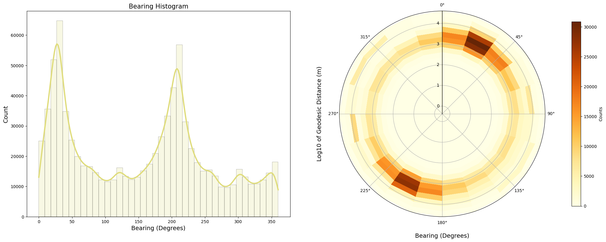
We can draw the following observations from these two plots:
-
There are two peaks for the bearing direction around 22 and 200 degrees for geodesic distances between 1 and 10 kilometers. We could infer that these are bearing directions pointing towards Manhattan.
-
There are other three lower peaks around 125, 300 and 350 degrees.
It appears that the bearing feature has some capability to distinguish the direction of the trip. This indicates potential importance of the bearing feature for the model. Also, it is important to note that the distance is on a logarithmic scale, emphasizing shorter trips.
For the categorical features vendor_id, passanger_count and store_and_fwd_flag we can use bar plots to visualize the distribution. Here the vendor_id refers to the companies that provide the taxi services, and the store_and_fwd_flag indicates whether the trip record was stored in vehicle memory before sending to the vendor.
fig, axes = plt.subplots(1, 3, figsize=(20, 5))  # 3 rows, 1 column

# Plot for vendor_id
vendor_id = df_train_large['vendor_id'].value_counts().sort_index()
vendor_id.plot(kind='bar', width=0.9, color=[yellow, orange], edgecolor=grey, ax=axes[0])
axes[0].set_title('Company that Provides the Taxi Service')
axes[0].set_xlabel('vendor_id')
axes[0].set_ylabel('Frequency')
axes[0].tick_params(axis='x', rotation=0)

# Plot for store_and_fwd_flag
store_fwd_flag = df_train_large['store_and_fwd_flag'].value_counts().sort_index()
np.log(store_fwd_flag).plot(kind='bar', width=0.9, color=[yellow, orange], edgecolor=grey, ax=axes[1])
axes[1].set_title('Trip Data Stored in Vehicle Memory (?)')
axes[1].set_xlabel('store_and_fwd_flag')
axes[1].set_ylabel('Frequency (log scale)')
axes[1].tick_params(axis='x', rotation=0)

# Plot for passenger_counts
passenger_counts = df_train_large['passenger_count'].value_counts().sort_index()
passenger_counts.plot(kind='bar', width=0.9, color=[orange], edgecolor=grey, ax=axes[2])
axes[2].set_title('Number of Passengers')
axes[2].set_xlabel('passenger_count')
axes[2].set_ylabel('Frequency')
axes[2].tick_params(axis='x', rotation=0)

plt.tight_layout()
plt.show()
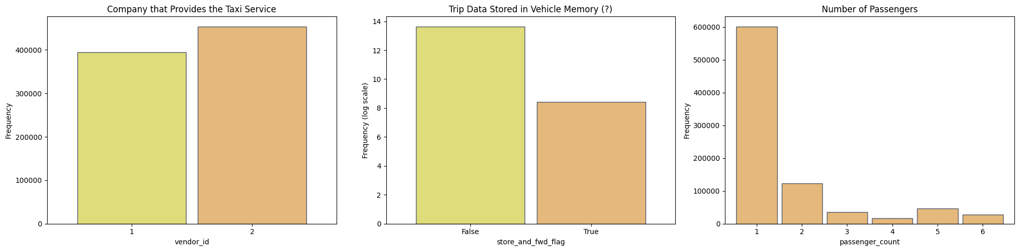
We can state the following observations:
-
The
vendor_id2 has more trips than thevendor_id1. This can be explained by the fact that thevendor_id2 has more vehicles than thevendor_id1. -
The
store_and_fwd_flagisFalsefor the majority of the trips (Note the use of log scale in the y-axis). This means that the majority of the trips are sent to the vendor immediately after the trip is completed. This could mean a lower chance of data loss. -
The majority of the trips have only one passenger.
For insight about temporal feature, like day_of_week and hour_of_day, we can plot those feature for each vendor_id. Let’s compare the taxi services of each company for the pickup location by the day of the week and hours of the day.
fig, axes = plt.subplots(1, 2, figsize=(20, 6))

# Plot for day_of_week
grouped_data_day = df_train_large.groupby(['vendor_id', 'day_of_week'])['pickup_date'].count().reset_index()
sns.scatterplot(data=grouped_data_day, x='day_of_week', y='pickup_date',
                hue='vendor_id', palette=['orange', 'yellow'], s=150, ax=axes[0])
axes[0].set_xticks(range(7))
axes[0].set_xticklabels(['Monday', 'Tuesday', 'Wednesday',
                        'Thursday', 'Friday', 'Saturday', 'Sunday'])
axes[0].set_xlabel(' ')
axes[0].set_title('Number of Pickups by Day of the Week')
axes[0].set_ylabel('Total Number of Pickups')
# Highlight weekdays for rush hour
axes[0].grid()

# Plot for hour_of_day
grouped_data_hour = df_train_large.groupby(['vendor_id', 'hour_of_day'])['pickup_date'].count().reset_index()
sns.scatterplot(data=grouped_data_hour, x='hour_of_day', y='pickup_date',
                hue='vendor_id', palette=['orange', 'yellow'], s=150, ax=axes[1])
axes[1].set_title('Number of Pickups by Hour of the Day')
axes[1].set_xlabel('Hour of the Day')
axes[1].set_ylabel('Total Number of Pickups')
# Highlight rush hour times
axes[1].axvspan(7, 10, color=grey, alpha=0.2)
axes[1].axvspan(16, 20, color=grey, alpha=0.2)
axes[1].grid()

# Adjust the legend for both subplots
for ax in axes:
    ax.legend(title='Vendor ID', loc='upper left')

plt.tight_layout()
plt.show()
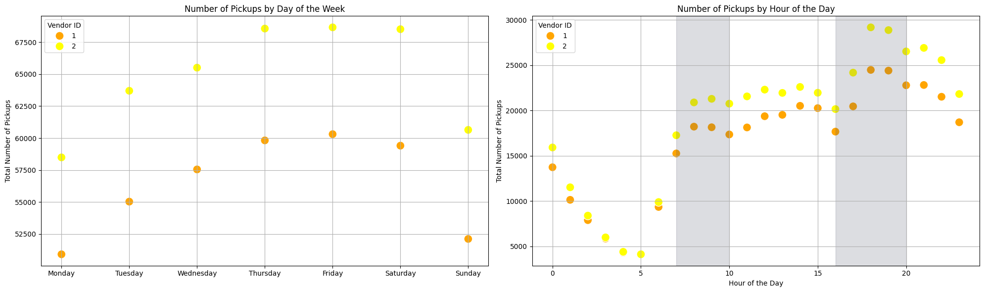
We can state the following observations based on the scatter plots:
-
There is lower number of trips on monday and sunday for both vendors, if vendor 2 having more trips than vendor 1. The higher number of trips is on thursday and friday.
-
For hours of the day, we can see that the vendor 2 has a closer number of trips than vendor 1.
-
We add a grey region in the second plot to indicate the rush hours feature
is_rush_hour, showing a well defined pattern of increase trips for both vendors between 7-10 a.m. and 4-8 p.m. -
There is a strong dip during the early morning hours. Here there is not much difference between the two vendors. Another dip occur around 4pm and then the numbers increase towards the evening.
For further insight about temporal features, we can count the trips for the hours of the day and plot the curves for months and days of the week.
grouped_month = df_train_large.groupby(['hour', 'month']).size().reset_index(name='count')
grouped_weekday = df_train_large.groupby(['hour', 'day_of_week']).size().reset_index(name='count')

# Define palettes
palette_month = sns.color_palette("tab20", n_colors=6)
palette_weekday = sns.color_palette("tab20", n_colors=7)

fig, axes = plt.subplots(1, 2, figsize=(25, 6))

# Month plot
sns.lineplot(   data=grouped_month, x='hour', y='count', hue='month',
                palette=palette_month, linewidth=2.5, ax=axes[0])

# Update the month legend
month_labels = ['Jan', 'Feb', 'Mar', 'Apr', 'May', 'Jun']
handles, labels = axes[0].get_legend_handles_labels()
axes[0].legend(handles=handles, title='Month', labels=month_labels, loc='upper left')

axes[0].set_xlabel('Hour of the Day')
axes[0].set_ylabel('Count')
axes[0].set_title('Hour of Day vs Count by Month')
axes[0].axvspan(7, 10, color=grey, alpha=0.2)
axes[0].axvspan(16, 20, color=grey, alpha=0.2)
axes[0].grid()

# Weekday plot
sns.lineplot(   data=grouped_weekday, x='hour', y='count', hue='day_of_week',
                palette=palette_weekday, linewidth=2.5, ax=axes[1])

# Update the weekday legend
weekday_labels = ['Mon', 'Tue', 'Wed', 'Thu', 'Fri', 'Sat', 'Sun']
handles, labels = axes[1].get_legend_handles_labels()
axes[1].legend(handles=handles, title='Day of the Week', labels=weekday_labels, loc='lower right')

axes[1].set_xlabel('Hour of the Day')
axes[1].set_ylabel('Count')
axes[1].set_title('Hour of Day vs Count by Weekday')

# Highlight rush hour times
axes[1].axvspan(7, 10, color=grey, alpha=0.2)
axes[1].axvspan(16, 20, color=grey, alpha=0.2)
axes[1].grid()

plt.show()
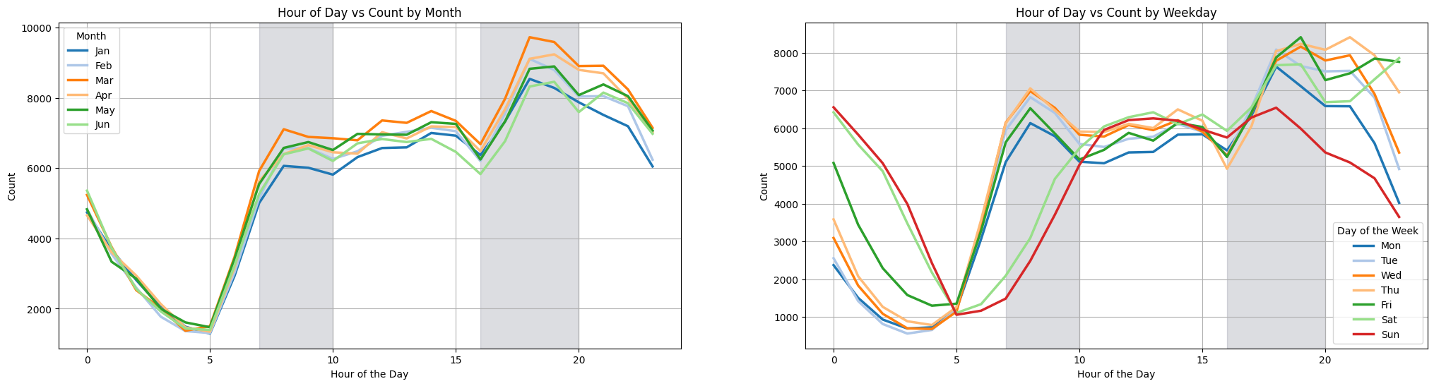
We can state the following observations based on the line plots:
-
For the months they show similar patterns as before for the hours of the day. Again respecting the rush hours feature
is_rush_hour, showing a well defined pattern of increased trips between 7-10 a.m. and 4-8 p.m. -
January and June experience fewer trips, while March and April see a greater number of trips.
-
In the Feature Engineering section, we excluded Saturdays and Sundays from the
is_rush_hourdefinition. This choice is supported by the lines for Saturday and Sunday, which show significantly fewer trips than the other days of the week during the morning rush hours of 7-10 AM. However, during the evening rush hours of 4-8 PM, an interesting pattern occurs: Friday and Saturday see an increase in trips that extends into late night. This can be explained by the fact that Friday and Saturday are the days of the week with more nightlife activity in NYC.
5.2 Feature Correlations
In the previous section, we visualized the distribution of some individual features to understand and get insights about the data. Now, we will look at the correlation between those features and the target feature trip_duration and the correlation between each other.
On the left, we plot a hexbin for the correlation between the log trip_duration and the log geodesic_distance, and in the right again we plot a 2d histogram in polar coordinates, where the radial is the log of the trip_duration and the polar angle is the log of the bearing feature. We can state the following observations:
fig = plt.figure(figsize=(20, 8))

log_geodesic_distance = np.log1p(df_train_large['geodesic_distance'])
log_trip_duration = np.log1p(df_train_large['trip_duration'])

ax1 = fig.add_subplot(121)
ax1.hexbin(log_geodesic_distance, log_trip_duration, gridsize=100, cmap='YlOrBr', mincnt=1)
ax1.set_xlabel('Log10 of Geodesic Distance (m)', fontsize=14)
ax1.set_ylabel('Log1p of Trip Duration (s)', fontsize=14)

# Add a color bar to represent counts on the polar plot
cbar_hexbin = plt.colorbar(mappable, ax=ax1, pad=0.1, fraction=0.035)
cbar_hexbin.ax.set_ylabel('Counts')

# Add a polar subplot for the 2D histogram
ax2 = fig.add_subplot(122, projection='polar')  # 1 row, 2 columns, second subplot with polar projection
bearing_rad = np.radians(df_train_large['bearing'])
hist, theta, r, mappable = ax2.hist2d(  bearing_rad,
                                        log_trip_duration,
                                        bins=[20, 20],
                                        cmap='YlOrBr')

# Customize the polar plot
ax2.set_theta_zero_location('N')  # Set 0 degrees to the south
ax2.set_theta_direction(-1)  # Clockwise
ax2.set_xlabel('Bearing (Degrees)', fontsize=14, labelpad=20)
ax2.set_ylabel('Log1p of Trip Duration (s)', fontsize=14, labelpad=40)
ax2.grid(True)

# Add a color bar to represent counts on the polar plot
cbar_polar = plt.colorbar(mappable, ax=ax2, pad=0.1, fraction=0.035)
cbar_polar.ax.set_ylabel('Counts')

plt.tight_layout()
plt.show()
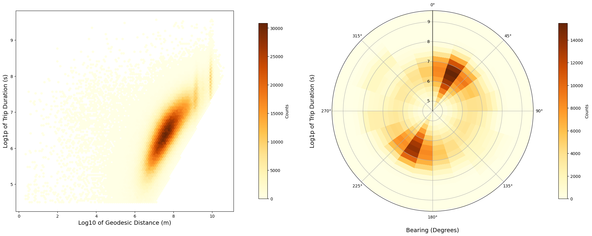
By the left plot, we can see that there is a positive correlation between the log of the trip_duration and the log of the geodesic_distance. This is expected because the longer the distance, the longer the trip duration. However, this correlation is not linear, as we can see that the correlation is stronger for shorter distances. This can be explained by the fact that the longer the distance, the more traffic and other factors can influence the trip duration.
In the polar plot, there are two peaks for the bearing direction around 22 and 200 degrees for trip duration approximated between 405 and 1098 seconds, which implies that most trips are short in this directions, probably covering distances between 1 and 10 kilometers as we previously stated.
def plot_feature_importance(df, x, y, ax, threshold=0.002, title='Feature Importance',
                            xlabel='Features', ylabel='Importance', palette=None):
    """
    Function to plot the feature importance with a distinction of importance based on a threshold.

    Parameters:
    - df: pandas.DataFrame
        DataFrame containing features and their importance scores.
    - x: str
        Name of the column representing feature names.
    - y: str
        Name of the column representing feature importance scores.
    - ax: matplotlib axis object
        Axis on which to draw the plot.
    - threshold: float, optional (default=0.002)
        Value above which bars will be colored differently.
    - pad: float, optional (default=5.0)
        Adjust the layout of the plot.
    - title: str, optional (default='Feature Importance')
        Title of the plot.
    - xlabel: str, optional (default='Features')
        Label for the x-axis.
    - ylabel: str, optional (default='Importance')
        Label for the y-axis.
    - palette: list, optional
        A list of two colors. The first color is for bars
        below the threshold and the second is for bars above.

    Returns:
    - None (modifies ax in-place)
    """
    if palette is None:
        palette = ["blue", "red"]

    blue, red = palette
    colors = [red if value >= threshold else blue for value in df[y]]
    sns.barplot(x=x, y=y, data=df, ax=ax, alpha=0.5, palette=colors, legend= False, hue = x)
    ax.set_xticks(range(len(df[x])))
    ax.set_xticklabels(df[x], rotation=90, fontsize=12)
    ax.set_ylabel(ylabel, fontsize=15)
    ax.set_xlabel(xlabel, fontsize=15)
    ax.grid(axis='y')
    ax.set_title(title, fontsize=15)
To better understand the relationship between our target feature, trip_duration, and the other features, we explore two distinct statistical measures: mutual information and the Spearman correlation coefficient.
Mutual information evaluates the mutual dependence between two variables and captures both linear and non-linear relationships. This measure is robust against outliers and provides reliability for any numerical or categorical features. On the other hand, Spearman correlation, while also addressing both linear and non-linear relationships, does not assume any specific data distribution. We can interpret the comparison of these metrics as follows:
-
If mutual information has a strong relationship and weak Spearman correlation: can suggest the presence of a complex, non-linear or non-monotonic relationship. Mutual information captures all kinds of dependencies, including non-linear ones, so it can detect relationships that Spearman correlation might miss if they don’t involve consistently increasing or decreasing ranks.
-
If mutual information has a weak relationship and strong Spearman correlation: can suggests a monotonic relationship. Spearman correlation assesses how well the relationship between two variables can be described by a monotonic function, which means as one variable increases, the other also consistently increases (or decreases).
features_to_drop = ['id', 'pickup_date', 'dropoff_date', "year",
                    "min_of_day", "hour", "day_of_year", "minute" ]
df_train_dropped = df_train_large.drop(features_to_drop, axis=1).copy()

# Sample 50% with Random permutation
sample_size = int(len(df_train_large) * 0.5)
random_indices = np.random.permutation(df_train_large.index)
sample_indices = random_indices[:sample_size]

# Create a sample DataFrame
df_sampled = df_train_dropped.loc[sample_indices].drop('trip_duration', axis=1).copy()
Y_train_large = df_train_large['trip_duration'].copy()
Y_sampled = Y_train_large.loc[sample_indices]

# Mutual information
mi_values = mutual_info_classif(df_sampled, Y_sampled, discrete_features=False)
mi_column = pd.DataFrame(   mi_values, index=pd.Index(df_sampled.columns, name='features'),
                            columns=['mutual_inf']).sort_values(by='mutual_inf', ascending=False)
mi_column_reset = mi_column.reset_index()

# Spearmann correlation
spearman_corr = df_train_dropped.corr(method='spearman')['trip_duration'].agg(np.abs)\
                                                .sort_values(ascending=False)\
                                                .drop('trip_duration')\
                                                .to_frame()
spearman_column = spearman_corr.reset_index()
spearman_column.columns = ['features', 'spearman_corr']


# Plots
fig, ax = plt.subplots(1, 2, figsize=(25, 10))

plot_feature_importance(mi_column_reset, x='features', y='mutual_inf', ax=ax[0], threshold=0.02,
                        title="Mutual Information", xlabel=" ",
                        ylabel="Taxi Trip Duration Correlation", palette=[yellow, orange])

plot_feature_importance(spearman_column, x='features', y='spearman_corr', ax=ax[1], threshold=0.02,
                        title="Spearman Correlation", xlabel=" ",
                        ylabel="Taxi Trip Duration Correlation", palette=[yellow, orange])

plt.tight_layout(pad=5.0)
plt.show()
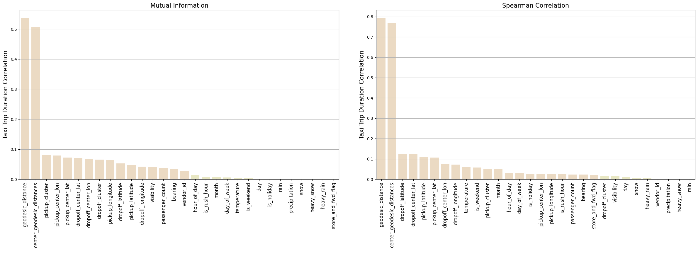
The strongest correlation for trip_duration are the distance measures, geodesic_distance and center_geodesic_distances, as expected. The other features compared to the distances are less correlated, but yet have some relevance. Most of those features are related with pickup and dropoff locations.
-
The two metrics show that most of the feature location have a strong correlation, but they do not agree with some features locations. For this purpose we could create a plot only for those features for a clear understanding of the correlation. I will skip this step for now.
-
The
bearingshows a much more strong correlation in the mutual information than the Spearman. In both plots the bearing is less correlated then the location features. This can suggest the bearing has a more complex, non-linear or non-monotonic relationship withtrip_duration. This could be explained due to the directional effects that aren’t increasing or decreasing with time, because the bearing only provides the angle from the direction of pickup to the dropoff locations. -
The majority of climate features do not have a strong correlation with the target feature, with exception for the
visibilityandtemperaturefeatures. Forvisibilitywe have a strong correlation for the mutual information and a weak correlation for Spearman, suggesting a complex, non-linear or non-monotonic relationship. Fortemperature, the opposite happens, suggesting a more monotonic relationship, that could be explained when extreme temperatures could consistently affect traffic patterns. -
Almost all temporal features do not show a strong correlation with the target feature
trip_durationfor mutual information. However, for the Spearman correlation, the temporal featureshour_of_day,month,is_weekendandday_of_week,is_hollidayshow a better correlation, suggesting a monotonic relationship. This is expected because temporal features can increase or decrease traffic related to the time of day, month, weekends, and days of the week.
We can consider selecting two sets of relevant features from both metrics, and than take the union of these two sets. This will ensure that we select features that are relevant for both metrics.
threshold = 0.02
best_spearman = spearman_corr[spearman_corr['trip_duration'] >= threshold].index.tolist()
print("Best Spearman features for trip_duration correlation:\n", best_spearman)

best_mi = list(mi_column[mi_column['mutual_inf'] > threshold].index)
print("\n Best mutual information features for trip_duration:\n", best_mi)


mi_set = set(best_mi)
spearman_set = set(best_spearman)

union_mi_spearman  = mi_set.union(spearman_set)
print('\nUnion set:\n', union_mi_spearman)
intersec_mi_spearman  = mi_set.intersection(spearman_set)
print('\nIntersection set:\n', intersec_mi_spearman)
Best Spearman features for trip_duration correlation:
 ['geodesic_distance', 'center_geodesic_distances', 'dropoff_latitude', 'dropoff_center_lat',
 'pickup_latitude', 'pickup_center_lat', 'dropoff_center_lon', 'dropoff_longitude', 'temperature',
 'is_weekend', 'pickup_cluster', 'month', 'hour_of_day', 'day_of_week', 'is_holiday', 'pickup_center_lon',
 'pickup_longitude', 'is_rush_hour', 'passenger_count', 'bearing', 'store_and_fwd_flag']

 Best mutual information features for trip_duration:
 ['geodesic_distance', 'center_geodesic_distances', 'pickup_cluster', 'pickup_center_lon',
 'pickup_center_lat', 'dropoff_center_lat', 'dropoff_center_lon', 'dropoff_cluster', 'pickup_longitude',
 'dropoff_latitude', 'pickup_latitude', 'dropoff_longitude', 'visibility',
 'passenger_count', 'bearing', 'vendor_id']

Union set:
 {'is_holiday', 'dropoff_center_lon', 'dropoff_center_lat', 'passenger_count', 'store_and_fwd_flag',
 'pickup_longitude', 'hour_of_day', 'day_of_week', 'center_geodesic_distances', 'pickup_cluster',
 'pickup_latitude', 'dropoff_cluster', 'pickup_center_lat', 'dropoff_longitude', 'temperature',
 'month', 'is_rush_hour', 'is_weekend', 'vendor_id', 'visibility', 'geodesic_distance',
 'pickup_center_lon', 'bearing', 'dropoff_latitude'}

Intersection set:
 {'pickup_center_lat', 'dropoff_center_lon', 'dropoff_longitude', 'passenger_count', 'dropoff_center_lat',
 'pickup_longitude', 'geodesic_distance', 'pickup_cluster', 'pickup_center_lon', 'center_geodesic_distances',
 'bearing', 'dropoff_latitude', 'pickup_latitude'}
The intersection set has no feature related with climate feature. This confirm our previously assumption about the complex relationship between visibility and temperature with the target feature trip_duration. What it’s probably happening here is that mutual information can account for complex relation, but these features do not have a clear monotonic relationship necessary for a strong Spearman correlation. But we can still consider this features for our model, so we choose to use the union set of features to account both relevant feature in the two metrics.
def plot_corr_ellipses(data, figsize, **kwargs):
    """
    Plots a correlation matrix using ellipses to represent the correlations.

    Parameters:
    - data (pd.DataFrame): A 2D array or DataFrame containing the correlation matrix.
    - figsize: Tuple specifying the figure size.
    - kwargs: Additional keyword arguments for EllipseCollection.

    Returns:
    - A tuple containing the EllipseCollection object and the Axes object.

    """
    M = np.array(data)
    if not M.ndim == 2:
        raise ValueError('Data must be a 2D array.')

    # Mask the upper triangle of the matrix
    mask = np.triu(np.ones_like(M, dtype=bool), k=1)
    M[mask] = np.nan

    # Initialize the plot
    fig, ax = plt.subplots(1, 1, figsize=figsize, subplot_kw={'aspect': 'equal'})
    ax.set_xlim(-0.5, M.shape[1] - 0.5)
    ax.set_ylim(-0.5, M.shape[0] - 0.5)
    ax.invert_yaxis()
    ax.set_xticklabels([])
    ax.grid(False)

    # Determine xy locations of each ellipse center
    xy = np.indices(M.shape)[::-1].reshape(2, -1).T

    # Define ellipse properties
    w = np.ones_like(M).ravel() + 0.01  # Widths of ellipses
    h = 1 - np.abs(M).ravel() - 0.01   # Heights of ellipses
    a = 45 * np.sign(M).ravel()        # Rotation angles

    # Create and add the ellipse collection
    ec = EllipseCollection( widths=w, heights=h, angles=a, units='x', offsets=xy,
                            norm=Normalize(vmin=-1, vmax=1), transOffset=ax.transData,
                            array=M.ravel(), **kwargs)
    ax.add_collection(ec)

    # Add a color bar for correlation values
    cb = fig.colorbar(ec, ax=ax, orientation='horizontal', fraction=0.047, pad=0.00)
    cb.ax.xaxis.set_ticks_position('bottom')
    cb.ax.xaxis.set_label_position('bottom')
    cb.ax.tick_params(top=False, labeltop=False)

    # Feature names on the diagonal
    if isinstance(data, pd.DataFrame):
        diagonal_positions = np.arange(M.shape[1])
        for i, label in enumerate(data.columns):
            ax.annotate(" -  " + label, (i - 0.4, i - 1), ha='left', va='bottom', rotation=90)
        ax.set_yticks(diagonal_positions)
        ax.set_yticklabels(data.index)

    # Hide the plot spines
    for spine in ax.spines.values():
        spine.set_visible(False)

    return ec, ax
Let’s plot a special kind of heatmap using ellipses to better see the correlation between each feature. We choose to use the spearman correlation. The orientation of the ellipse indicates whether two variables are positively correlated (ellipse is pointed to the top right) or negatively correlated (ellipse is pointed to the top left). The shading and width of the ellipse indicate the strength of the association: thinner and darker ellipses correspond to stronger relationships. We choose to use the union set of features to account both relevant feature in the two metrics:
df_train_union = df_train_large[list(union_mi_spearman)].copy()

correlation_matrix = df_train_union.corr(method='spearman')
# Use the function with the Spearman correlation matrix
ec, ax = plot_corr_ellipses(correlation_matrix, figsize=(10, 10), cmap='PuOr')
plt.tight_layout()
plt.show()
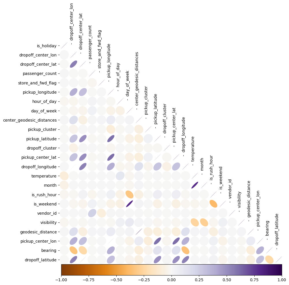
We can observe that some features are highly correlated, which may render certain features redundant for our model:
- The
geodesic_distanceis highly correlated withcenter_geodesic_distances. - All the pickup and dropoff location features are highly correlated with the pickup and dropoff cluster features.
We have chosen to retain these features to evaluate their impact on the model’s performance.
5.3 Conclusion from EDA
The EDA revealed that Out of 39 features, with 28 having been crafted in the Feature Engineering section, a total of 24 were identified having some relevant correlation with the target feature or with another features. Let’s select the relevant features to train our machine learning models.
# Select relevant features from EDA and the target feature
relevant_features = list(union_mi_spearman) + ['trip_duration']

df_train_processed = df_train[relevant_features].copy()
df_val_processed = df_val[relevant_features].copy()
df_test_processed = df_test[relevant_features].copy()
df_train_large_processed = df_train_large[relevant_features].copy()

# Save the processed datasets with target feature
df_train_processed.to_csv('../data/processed/train.csv', index=False)
df_val_processed.to_csv('../data/processed/validation.csv', index=False)
df_test_processed.to_csv('../data/processed/test.csv', index=False)
df_train_large_processed.to_csv('../data/processed/train_large.csv', index=False)
We could see that the features geodesic_distance and center_geodesic_distances have a strong and a positive correlation, yet they do not have linear correlation. This align with our conclusion that longer distances generally require longer travel times, but the relationship is not linear due to factors like traffic conditions. Also, certain direction was preferred for shorter trips, probably accounting trips within Manhattan borough. This could be seen for the bearing feature, which shows a complex correlation with trip_duration. Those feature can be expected to be important for our model.
For Climate feature, most show a very weak correlation with trip_duration, except for visibility and temperature. Only this two features having a better correlation was contraintuitive, because was expected that more climate features could have a more strong correlation with trip_duration. Probably, because we only have records from the first 6 months of 2016, the impact of some climate features could not be fully captured, resulting in a weak correlation.
For temporal features, we could see that the hour_of_day, month, is_weekend, day_of_week, is_holliday show a better correlation with trip_duration, suggesting a monotonic relationship. This is expected because temporal features can increase or decrease traffic related to the time.
For pickup and dropoff locations features, we could see that the majority of the features show a good correlation with trip_duration. This is expected because the location features can indicate for our model traffic patterns related to the location.
6. Model Training and Validation
In this project, we choose to employ the XGBoost and Decision Tree Regressor models to train and predict the taxi_trip_duration. These models can capture complex relationships between the features and the target feature and they are robust against outliers. Even with our outliers handling, this kind of dataset can still have outliers due to unusual traffic conditions or other anomalies that we could not detect. In this section, We will use the df_train dataset to train the models and the df_val dataset to validate the predictions.
# Load the processed datasets for train, validation
df_train = pd.read_csv('../data/processed/train.csv')
df_val = pd.read_csv('../data/processed/validation.csv')

# Save Target feature
Y_train = df_train['trip_duration'].values
Y_val = df_val['trip_duration'].values
Y_train_log = np.log1p(Y_train)
Y_val_log = np.log1p(Y_val)

# Drop target feature
df_train.drop('trip_duration', axis=1, inplace=True)
df_val.drop('trip_duration', axis=1, inplace=True)
X_train = df_train.values
X_val = df_val.values
# Decision Tree Regressor
param_grid = {
    'max_depth': [ 2, 5, 10, None],
    'min_samples_leaf': [1, 2, 3],
    'min_samples_split': [2, 3, 5, 6]
}
dtr = DecisionTreeRegressor(random_state=random_state)

# Grid Search using RMSE as scoring metric
rmse_scorer = make_scorer(lambda y_true, y_pred: np.sqrt(mean_squared_error(y_true, y_pred)),
                            greater_is_better=False)
grid_search = GridSearchCV(estimator=dtr, param_grid=param_grid, scoring=rmse_scorer, cv= 5, n_jobs= 8)
grid_search.fit(X_train, Y_train_log)

# Best parameters and score
best_params = grid_search.best_params_
best_score = np.sqrt(-grid_search.best_score_)

print("Best parameters found: ", best_params)
print("Best RMSE score from Grid Search: ", best_score)

Y_pred = grid_search.best_estimator_.predict(X_val)
rmse_val = np.sqrt(mean_squared_error(Y_val_log, Y_pred))

Y_pred = grid_search.best_estimator_.predict(X_train)
rmse_train = np.sqrt(mean_squared_error(Y_train_log, Y_pred))

print(f'\n Train-rmse:{rmse_train} \t\t Validation-rmse:{rmse_val}')
Best parameters found:  {'max_depth': 10, 'min_samples_leaf': 2, 'min_samples_split': 5}
Best RMSE score from Grid Search:  0.6045244076485581

 Train-rmse:0.35810464512423246 		 Validation-rmse:0.3645839928468323
dmatrix_train = xgb.DMatrix(X_train, label = Y_train_log)
dmatrix_val  = xgb.DMatrix(X_val , label = Y_val_log)
watchlist = [(dmatrix_train, 'train'), (dmatrix_val, 'validation')]


parms = {   'max_depth':8,
            'objective':'reg:squarederror',
            'eta'      :0.3,
            'subsample':0.7,
            'lambda'  :4,
            'colsample_bytree':0.9,
            'colsample_bylevel':1,
            'min_child_weight': 10,
            'nthread'  :8,
            'eval_metric': "rmse",
            'seed': random_state}

evals_test_val = {}
xgb_model = xgb.train(  parms, dmatrix_train, num_boost_round=1000, evals = watchlist,
                        early_stopping_rounds=30, maximize=False, verbose_eval=50,
                        evals_result = evals_test_val)

print(f'\n Score = {xgb_model.best_score:1.5f}\n n_boost_round = {xgb_model.best_iteration:d}')
[0]	train-rmse:0.56721	validation-rmse:0.56764
[50]	train-rmse:0.29455	validation-rmse:0.30990
[100]	train-rmse:0.27962	validation-rmse:0.30561
[150]	train-rmse:0.26882	validation-rmse:0.30426
[200]	train-rmse:0.26045	validation-rmse:0.30408
[246]	train-rmse:0.25376	validation-rmse:0.30415

 Score = 0.30402
 n_boost_round = 217
7. Model Evaluation on Test Set
The XGBoost model outperforms the Decision Tree Regressor in both the training and validation datasets. To verify that our model truly has predictive power and isn’t just overfitting, we’ll assess it against the df_test set. Additionally, we’ll compare its performance with the df_train_large set for a more comprehensive evaluation. Testing on the df_train_large set, helps confirm that our model’s effectiveness isn’t limited to the smaller df_train dataset. This dual approach of testing against the unseen data (df_test) and a larger training set (df_train_large) can confirm the predictive power of the model.
# Load the processed datasets for train large and validation
df_train_large = pd.read_csv('../data/processed/train_large.csv')
df_test = pd.read_csv('../data/processed/test.csv')

# Save Target feature
Y_train_large = df_train_large['trip_duration'].values
Y_test = df_test['trip_duration'].values
Y_train_large_log = np.log1p(Y_train_large)
Y_test_log = np.log1p(Y_test)

# Drop target feature
df_train_large.drop('trip_duration', axis=1, inplace=True)
df_test.drop('trip_duration', axis=1, inplace=True)
X_train_large = df_train_large.values
X_test = df_test.values
dmatrix_train_large = xgb.DMatrix(X_train_large, label = Y_train_large_log)
dmatrix_test  = xgb.DMatrix(X_test   , label = Y_test_log)
watchlist = [(dmatrix_train_large, 'train_large'), (dmatrix_test, 'test')]

parms = {   'max_depth':8,
            'objective':'reg:squarederror',
            'eta'      :0.3,
            'subsample':0.7,
            'lambda'  :4,
            'colsample_bytree':0.9,
            'colsample_bylevel':1,
            'min_child_weight': 10,
            'nthread'  :8,
            'eval_metric': "rmse",
            'seed': random_state}

evals_test_train= {}
xgb_model = xgb.train(    parms, dmatrix_train_large, num_boost_round=1000, evals = watchlist,
                            early_stopping_rounds=30, maximize=False, verbose_eval=50,
                            evals_result = evals_test_train)

print(f'\n Score = {xgb_model.best_score:1.5f}\n n_boost_round = {xgb_model.best_iteration:d}')
[0]	train_large-rmse:0.56734	test-rmse:0.56765
[50]	train_large-rmse:0.29908	test-rmse:0.30796
[100]	train_large-rmse:0.28683	test-rmse:0.30243
[150]	train_large-rmse:0.27813	test-rmse:0.30017
[200]	train_large-rmse:0.27132	test-rmse:0.29918
[250]	train_large-rmse:0.26580	test-rmse:0.29838
[300]	train_large-rmse:0.26079	test-rmse:0.29799
[350]	train_large-rmse:0.25593	test-rmse:0.29770
[400]	train_large-rmse:0.25169	test-rmse:0.29765
[412]	train_large-rmse:0.25070	test-rmse:0.29760

 Score = 0.29759
 n_boost_round = 382
8. Conclusion
rmse_train = evals_test_val['train']['rmse']
rmse_val = evals_test_val['validation']['rmse']

rmse_train_large = evals_test_train['train_large']['rmse']
rmse_test = evals_test_train['test']['rmse']

# Calculating the number of epochs for all datasets
epochs_train = range(len(rmse_train))
epochs_val = range(len(rmse_val))
epochs_train_large = range(len(rmse_train_large))
epochs_test = range(len(rmse_test))

# Create subplots
fig, axes = plt.subplots(1, 2, figsize=(14, 6))

# Plotting Train and Validation RMSE
axes[0].plot(epochs_train, rmse_train, label='Train', color = orange, linewidth=3)
axes[0].plot(epochs_val, rmse_val, label='Validation', linestyle='--', color = yellow, linewidth=3)
axes[0].set_xlabel('Epochs')
axes[0].set_ylabel('RMSE')
axes[0].set_title('Train vs Validation')
axes[0].grid()
axes[0].legend()

# Plotting Train Large and Test RMSE
axes[1].plot(epochs_train_large, rmse_train_large, label='Train Large', color = orange, linewidth=3)
axes[1].plot(epochs_test, rmse_test, label='Test', linestyle='--', color = yellow, linewidth=3)
axes[1].set_xlabel('Epochs')
axes[1].set_ylabel('RMSE')
axes[1].set_title('Train Large vs Test')
axes[1].grid()
axes[1].legend()

plt.tight_layout()
plt.show()
The plots show the RMSE score over the number of epochs for the df_train and df_val on the left, and for the df_train_large and df_test on the right. There’s a small gap of approximately 0.05 between the training and validation/test RMSEs, which is typical as models tend to perform better on the data they have seen (training data). Both validation/test sets reach a plateau around 0.3 RMSE, which is expected with data the model has not seen before.
Overall, the model performs well on the test/validation set with a RMSE of approximately 0.30. The plots suggest that the model has predictive power and is learning without showing signs of overfitting or data leakage.
feature_importances = xgb_model.get_score(importance_type='gain')

# Map indices to names
feature_importances_named = {relevant_features[int(k[1:])]: v for k, v in feature_importances.items()}
df_feature_importance = pd.DataFrame(list(feature_importances_named.items()),
                        columns=['features', 'importance']).sort_values(by='importance', ascending=False)


fig, ax = plt.subplots(1, 1, figsize=(15, 8))
plot_feature_importance(df_feature_importance, x='features', y='importance', ax=ax, threshold= 4,
                        title="XGBoost Feature Importance", xlabel=" ",
                        ylabel="Information Gain", palette=[yellow, orange])

plt.tight_layout(pad=5.0)
plt.show()
The feature importance using Information Gain from the XGBoost model validates our EDA conclusions. The geodesic_distance feature has the highest information gain as we would expect. On the other hand, the center_geodesic_distance has very low information gain, as we previously suggested due to the redundant information. When features are highly correlated, tree-based models favor one over the other during the training process.
The hour_of_day, is_weekend, is_holiday, and day_of_week indicate that temporal features are important for our model. These features probably can indicate an increase or decrease in traffic related to the time. For example, is_weekend can indicate to our model that traffic patterns for weekends can be quite different from weekdays, having more traffic at different hours of the day, as we observed in the Feature Visualization section.
The dropoff_center_lat among other dropoff and pickup features was chosen by the model as the most important feature. This was also expected given the high correlation between the pickup and dropoff location and the pickup and dropoff for center of the clusters.
Overall, the XGBoost feature importance plot seems to validate our EDA findings, which is a good sign that the model is learning and making predictions based on the data. This is also a good sign that the model is not overfitting or presenting any indications of data leakage.
# Prediction  on test set the trained model
Y_test_pred_log = xgb_model.predict(dmatrix_test)


fig, axes = plt.subplots(nrows=1, ncols=2, figsize=(14, 6))

# distributions
sns.kdeplot(Y_test_pred_log, ax=axes[0], color=yellow, edgecolor= grey ,alpha=0.4, fill=True)
sns.kdeplot(Y_test_log, ax=axes[0], color=orange, edgecolor= grey, alpha=0.4, fill=True)

axes[0].grid()
axes[0].set_title('Trip Duration Distribution')
axes[0].legend(['Predicted on Test', 'Actual on Test'])

# CDFs
sns.ecdfplot(Y_test_pred_log, ax=axes[1], label="Predict on Test", color=yellow, alpha=1, linewidth=2)
sns.ecdfplot(Y_test_log, ax=axes[1], label="Actual on Test", color=orange, alpha=1, linewidth=2)

axes[1].grid()
axes[1].set_title('Trip Duration Cumulative Distribution')
axes[1].legend()


plt.tight_layout(pad=5.0)
plt.show()
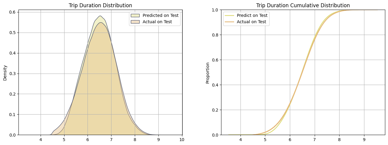
Finally, for a better visualization of how well our model is making predictions, we plot the distribution and the cumulative distribution of trip duration for the actual values in Y_test and the predicted values from the dataset df_test. Note that both plots consider the log1p of trip_duration. We can conclude that our model is making very good predictions, with an RMSE of 0.30, and a good distribution of the predicted values.
9. Deployment
# Training logic inside the script train_model.py
xgb_model = train_xgboost('../data/processed/train_large.csv', 'trip_duration')

# Save the model
xgb_model.save_model('../models/xgb_taxi_trip.json')
9.1 Testing Local and Web Service
df_test = pd.read_csv('../data/processed/test.csv').drop('trip_duration', axis=1)
url_local = "http://127.0.0.1:9696/predict"
# Sample one trip to make prediction
trip = df_test.sample(n=1).to_dict(orient='records')[0]
# Make a POST request to predict trip duration
requests.post(url_local, json = trip).json()
{'Trip Duration (hours:minutes:seconds)': '1:1:18'}
# Render Clound URL
url_clound = "https://taxi-trip-predict.onrender.com/predict"
trip = df_test.sample(n=1).to_dict(orient='records')[0]
requests.post(url_clound, json = trip).json()
{'Trip Duration (hours:minutes:seconds)': '0:20:16'}